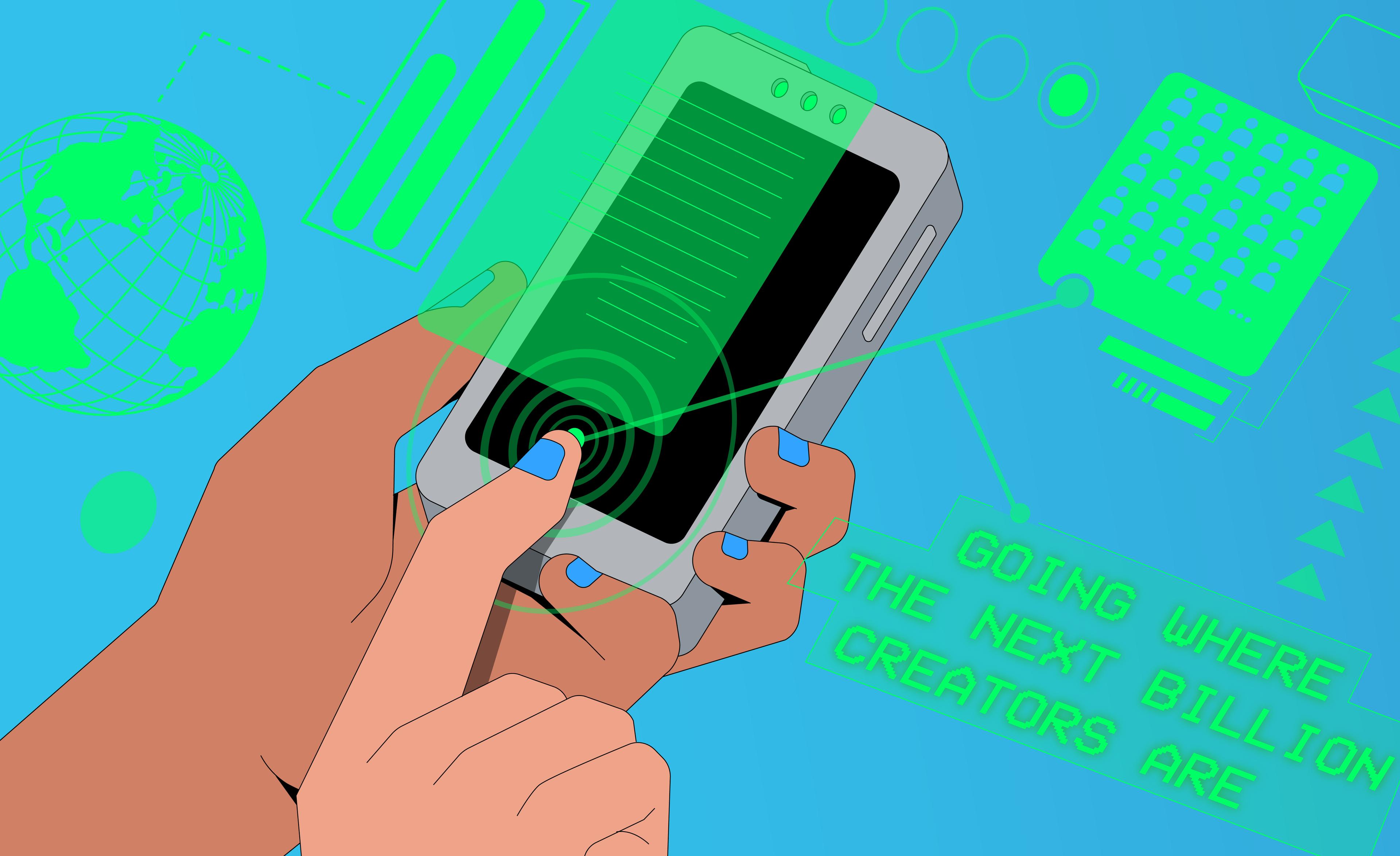
Mobile is the future of computing. But building good software creation tools for mobile devices is hard. Luckily, at Replit, we like to run toward the hard things.
This week, we launched a completely rearchitected mobile IDE for web. If you’ve used it before, the new version won’t look much different, but it will likely feel different.
Why We Care
Mobile devices are the world’s most ubiquitous computers. At Replit, we have kids coding their next big idea on their phone on the way to school, instead of scrolling through social media. We have local communities in developing countries learning & teaching code together on their phones, in order to get hired for jobs. We have colleagues coding prototypes in multiplayer and demoing their work on their phones, while they are on the go.
We even noticed users sharing Replit coding tutorials on TikTok:
@coding4python3 Antwoorden aan @wewillcum #replit #code #coding #coding4python3 #python ♬ origineel geluid - coding4python3
The future of personal computing will be on mobile devices. That’s how the next billion software creators will come online.
With this in mind, it’s important that we bring the best of Replit to our diverse community of users, regardless of their device, geolocation or circumstance. We have our work cut out for us!
The Rebuild
Our previous mobile client was lacking. After the initial build of the mobile IDE in 2020, we started hitting performance problems with our Redux-based plugin architecture.
The system used too much memory and CPU, making the mobile IDE feel laggy. On low-powered devices, it would crash often. Pieces of UI were plugins, arranged in floating windows. This made the UI and interactions feel clunky. It became hard to maintain and debug issues. This drove engineers away from touching it.
We spent the last few months rebuilding the mobile web client using a simpler & faster render tree and abstractions called “services”. Services are single-responsibility APIs for various platform capabilities. Examples include the filesystem, shellrunner and presence for multiplayer. We got rid of Redux completely.
The goals for the new iteration were:
- Move the source of truth to the backend.
- Services drive the state of the repl UI, including the files and state of the program. They also allow subscriptions so UI components can react to updates right away. This model makes synchronizing clients across devices easier and reduces our memory footprint. With Redux, we had dozens of reducers duplicating state that often drifted and caused unexpected bugs.
- Use a flexible & maintainable UI.
- We fought the urge to redesign the mobile UI to keep this project scoped. Instead, we focused on writing modular React components that used our new design system, along with Hooks for local view state.
We now have a lighter & more manageable mobile web client overall.
We tested early with our explorers, who felt it was “so [much] smoother”. While A/B testing the new changes, we saw up to 2x increase in weekly retention on mobile.
What's Next?
With this big piece of work done, we are focusing on the feedback we hear a lot from our community. These past few months, we've also interviewed users to better understand their pain points and workflows on mobile. We’re excited to bring you the next version of our mobile IDE soon. Our upcoming top projects are:
- Make core mobile ergonomics better
- Make repls run faster across the world
And maybe a surprise or two.
And we’re hiring.
If you are excited by hard and impactful problems like these — and we know you are — come join our team!


