
At Replit, we have a small engineering and design team supporting millions of users. Our secret is investing in good tools that make us more productive. In this blog post we'll give you an insider look into how we implemented one such tool - the Replit design system (or RUI for short).
The project started as a collection of growth pains:
- Designers were stretched thin on multiple projects and they couldn't be involved in small tactical decisions
- UI was inconsistent across the product
- Reusing UI code was hard, so engineers built new ones (for example, we had 7 different Avatar components)
So, we set to build a design system that would help us scale. The high level goals:
- Cover 90% of what we need (don't chase the very special cases)
- Easy, intuitive and fun to use
- Retain the full power of CSS when it's needed
Technical path
Replit's frontend is built on top of React, a very popular library for building user interfaces. The React ecosystem has dozens of libraries and toolkits for making UIs. So many, that picking one is a hard problem!
Here's a list of libraries and approaches we have considered, and the pros and cons we weighed:
Styled JSX
styled-jsx comes built-in with Next.js (which we also use), so most of Replit was styled with it.
function AppsList(props) {
  return (
    <ul className="list">
      <AppComponent />
      <style jsx>{`
        .list {
          color: ${props.cool ? 'blue' : 'black'}
          padding: var(--spaceing-2);
        }
      `}</style>
    </ul>
  )
}
Pros:
- Easy to hack together: there's nothing to import, just put the CSS next to your components.
- Class names communicate purpose (e.g.
.section,.title) - Just copy-paste CSS from anywhere
Cons:
- Too easy to reinvent the wheel (which resulted in 7 different
<Avatar>component implementations) - Composition is hard and confusing
- The defaults are not app-friendly (e.g.
box-sizing,display: box) - Easy to have typos in CSS that can only be inspected visually (did you notice
--spaceing-2above?)
Styled Components
styled-components was the first library that pioneered a "styled" API: making custom React components with CSS attached. Today, other libraries support a similar way of attaching CSS to components.
const AppsList = styled.ul((props) => {
  color: props.cool ? 'blue' : 'black',
  padding: tokens.spacing2;
});
Pros:
- Can use TypeScripted APIs (typecheck, IDE support)
- Components have semantic names (good for readability)
- Extending components is easy (e.g.
styled(AppList))
Cons:
- Cumbersome for rapid prototyping - need to define intermediate components and use props to customize styling
Tailwind
Tailwind has gained a lot of momentum and is very popular among front-end engineers. The utility classes seem unorthodox and hard to use initially, but once you get used to it it's actually very fun to style components with Tailwind.
function AppsList(props) {
  return (
    <ul className={`p-2 ${props.cool ? 'fg-blue' : 'fg-black'}`}>
      <AppComponent />
    </ul>
  )
}
Pros:
- Utility classes are addictively productive
- Constrained space to choose from
- Densely packed code
Cons:
- Learning curve - need to remember the classnames
- Composition suffers the same CSS problems
- Hard to figure the purpose of divs (e.g.
p-2 flex-rowis what?) - All starts from basic HTML defaults
Style props (like Chakra UI)
Many design systems start from building a "universal React component", e.g. <Box> in Chakra UI. Other components then build on top of it, adding and removing some props.
function AppsList(props) {
  return (
    <Box padding={2} color={props.cool ? 'blue' : 'black'}>
      <AppComponent />
    </Box>
  )
}
Pros:
- Well typed API
- Control over which customizations are allowed (e.g. could allow
paddingbut notcolor) - Could handle things like accessibility for us
Cons:
- Domain and styling props mixed together
- Raw CSS power is hard to reach
- Composing conditional props is awkward
- Making extensible components requires props spreading
CSS prop (Emotion)
function AppsList(props) {
  return (
    <div css={{padding: 'var(--spacing-2)', color: props.cool ? 'blue' : 'black'}}>
      <AppComponent />
    </div>
  )
}
Pros:
- Easy to hack
- Intuitive CSS composition
Cons:
- Requires Babel config change
- CSS prop is "magic"
- Inline CSS can get verbose
String literals vs Objects
Emotion (and many other libraries) support 2 ways of defining CSS:
String literals:
css={css`
  color: ${props.cool ? 'blue' : undefined};
  padding: var(--spaceing-2);
`}
Pros: easy to copy-paste;
Cons: typos, string interpolation awkwardness
JavaScript Objects:
css={{
  padding: 'var(--spacing-2)',
  color: props.cool ? 'blue' : 'black',
  '&:hover': {

  },
}}
Pros: TypeScript, can do some pre-processing with code;
Cons: hard to copy-paste, more keypresses to type out
RUI API
In the end we landed on a system that's using Emotion with object-like styles, has a basic <View> primitive, and provides tailwind-like utility traits that can be mixed in.
Here's an example:
function AppsList(props) {
  return (
    <View tag="ul" css={[
      rcss.p(2), rcss.rowWithGap(1),
      rcss.color.foregroundDimmer,
      props.cool && rcss.color.accentPrimaryDimmer
    ]}>
      <AppComponent />
    </View>
  )
}
Viewis our basic building block. Inspired by React Native Web, it has a bunch of basic styles applied, e.g.display: flex,box-sizing: border-box, etc.Viewaccepts an optionaltagprop that makes sure the component is rendered as an appropriate semantic HTML element.- The
cssprop is powered by Emotion. It accepts an object or an array of objects that contain CSS. Thanks to TypeScript support, we get a great IDE integration and safety guarantees (no more typos!) rcss(stands for Replit CSS) is a set of utilities that are commonly used, like color, padding, alignment, etc.
The utilities are super useful and have replaced most of our old "layout components". For example, we have a utility called rcss.rowWithGap that aligns children components in a row with a gap between them. In the past, we used a special <VStack> component for that. Using the utility is much nicer because it can be mixed into component style without making the React tree more complex.
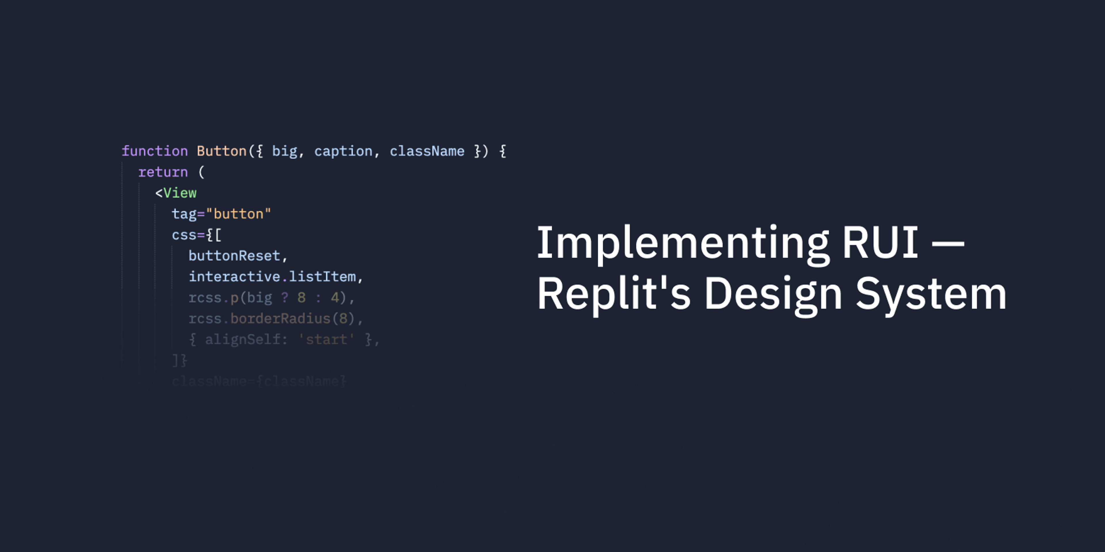
Here's another example. As you can see below, we can "mix-in" a bunch of shared styles (like interactive list item), and Emotion makes sure we can override bits we want to customize:
function Button({ big, caption, className }) {
  return (
    <View
      tag="button"
      css={[
        buttonReset,
        interactive.listItem,
        rcss.p(big ? 8 : 4),
        rcss.borderRadius(8),
        { alignSelf: 'start' },
      ]}
      className={className}
    >
      {caption}
    </View>
  );
}
If needed, the new <Button> can also be styled with css prop: <Button css={{color: red}} /> (that's why we need to pipe className — Emotion is a little unintuitive here).
Our experience so far
It's been ~ 4 months since we started using RUI and our experience has mainly been very positive. Engineers love the new system and feel productive from day one.
The IDE support means that the APIs are discoverable and type-safe, so we have more confidence than ever shipping new code.
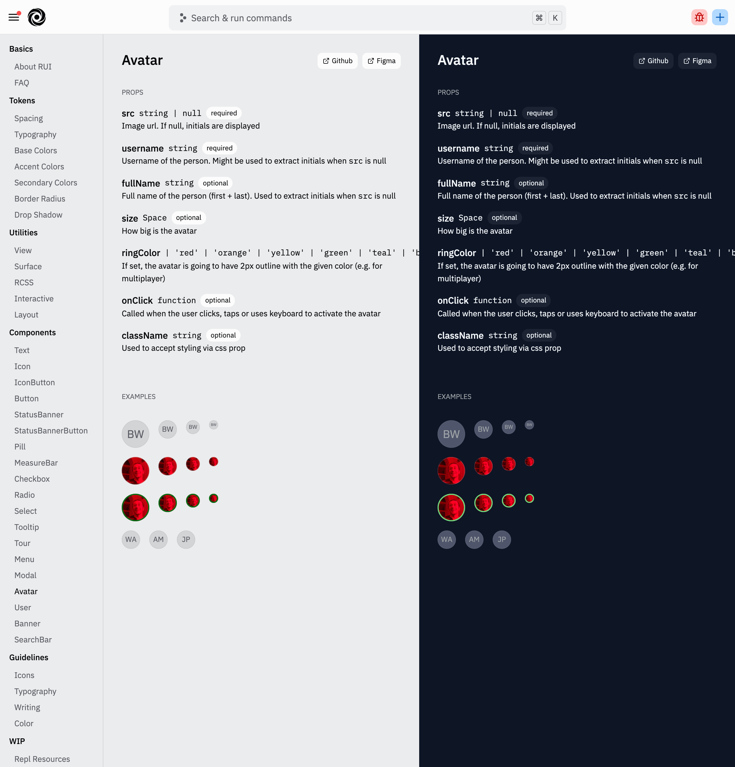
Alongside the design system we've also built an internal page that has component examples and documentation (generated from source code).
All our new code is written using RUI, and we opportunistically upgrade the old <styled jsx>, which results in much less code.
Acknowledgements
Big props to Ashlynn for brainstorming the API and implementation ideas and Barron for setting the design system principles principles and being a kick-ass designer-who-codes.
We expect that real success will only be achieved through close collaboration between system-sensitized visual and conceptual designers and design-centered software engineers and managers.
— Designing Visual Interfaces, 1995, Sun Microsystems