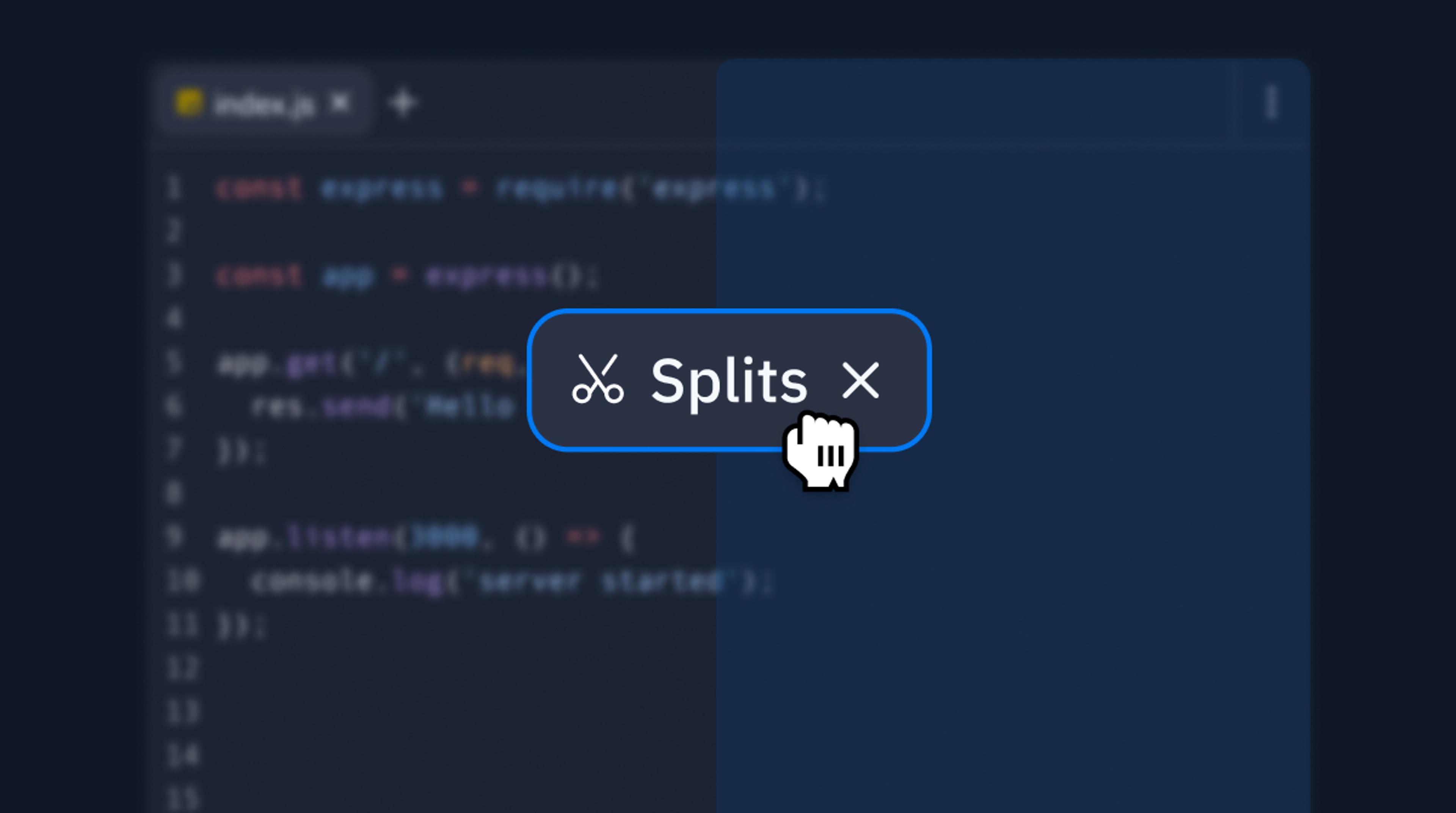


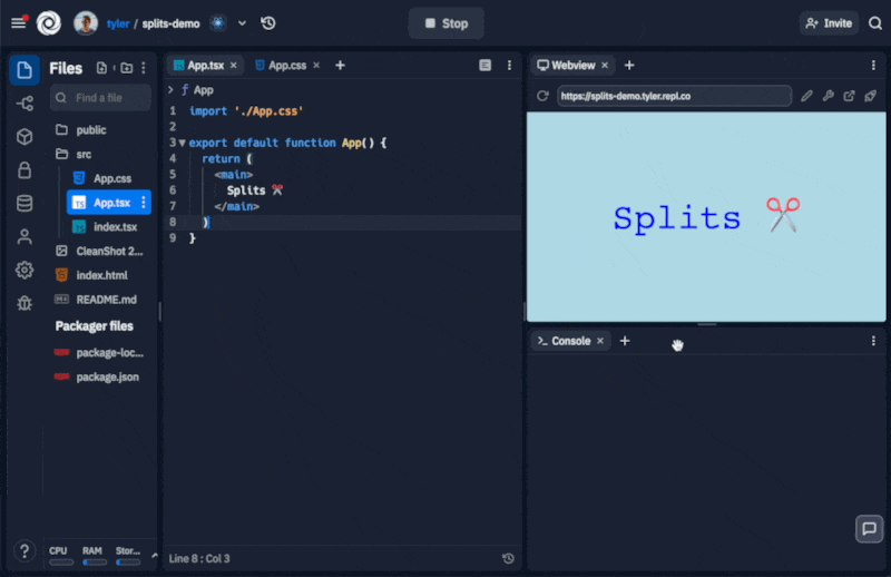
A few weeks ago we released Tabs, which allowed people to open up different files and tools you want, side by side. But the Workspace’s overall layout was still pretty static: you can only open things side by side, with no way to remove panes or quickly rearrange what you're focused on. That's changing today!
With splits, you can completely customize the layout of the Replit Workspace. This might not seem like a big deal, but it unlocks a lot of new possibilities for templates and makes Replit more accessible for both novices and experts.
How it works
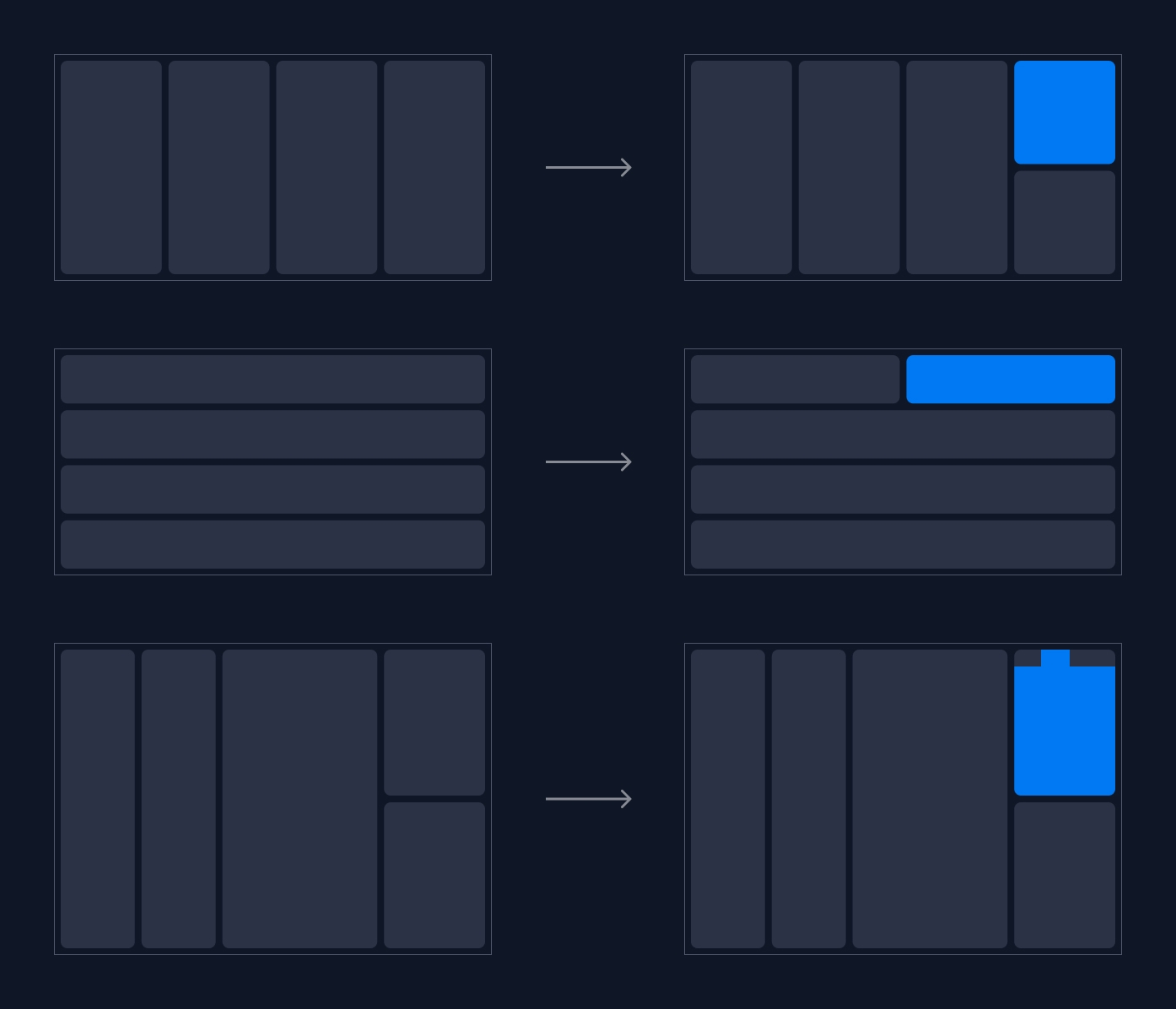
When you drag and drop a tab or pane over another pane, you have five primary hit areas: The header of every pane, and the top, right, bottom, and left "quadrants" of the pane. Our drag and drop logic actually uses conical sections to make dragging more ergonomic.
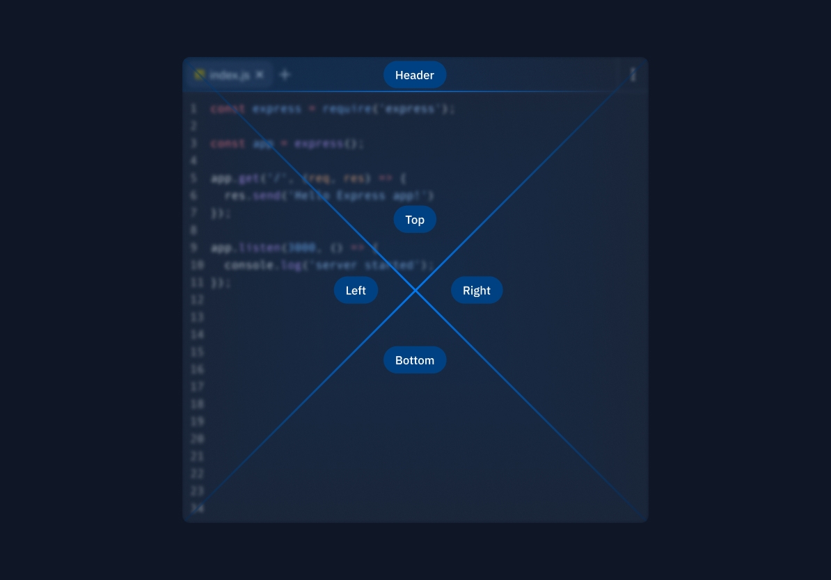
Dropping directly onto one of the primary quadrants will split the pane, and dragging tabs or panes into the header will merge their tabs together into one large pane.
If you click the ... menu in the corner of any pane, you'll see all of these options available here:
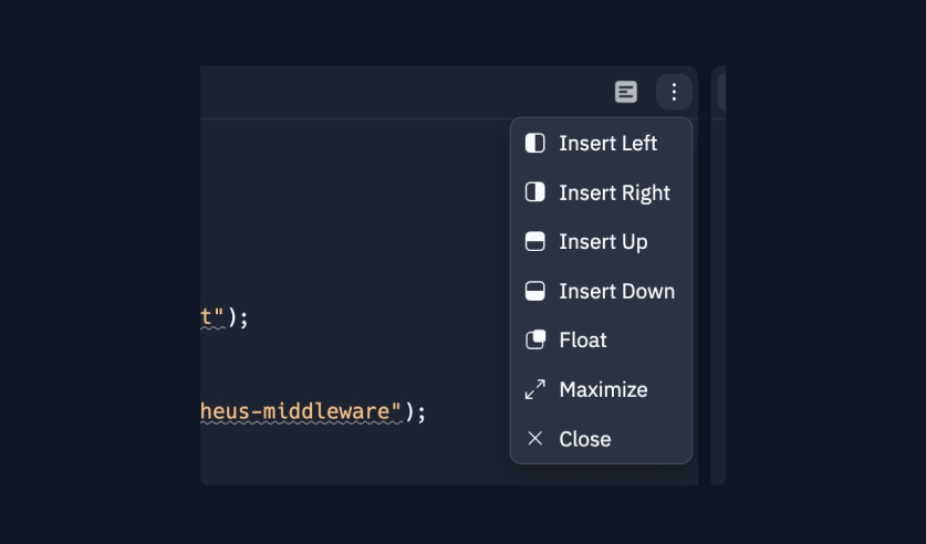
You'll also see Maximize which makes the pane take up the entire size of the Workspace, and Float which lets you move around a pane completely freely. To get back, you can click Unfloat.
Dragging tabs
When you drag a tab, only the tab itself is moved. When dropped onto a quadrant of another pane, that tab becomes its own pane as well.
Dragging panes
You can move entire panes around at once, not just tabs. This should feel pretty similar to how browser tabs and windows feel.
When you have one tab left in a pane, that tab is treated like a handle for the entire pane. Dragging the tab will move the entire pane.
Deleting the last tab will also remove the pane from layout.
There's a minimum drag radius of 50px to detach a pane "out" of the layout so you can rearrange it.
This is useful for a few reasons. Mainly, it helps you understand exactly how the layout will change with the pane you're dragging.
Secondly, it makes dragging mistakes easy to reverse: since other panes automatically fill up the remaining space in layout once a pane is removed, "undoing" an accidental drag means just dropping that pane right where you left off.
This also means switching two panes is as easy as picking one up and moving it to the other side.
Dragging from the filetree
You can also drag files from the filetree directly onto panes or headers. They share the same behavior as tabs.
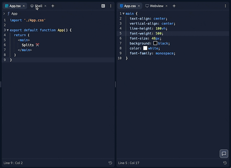
Floating panes
Lastly, you can actually escape splits entirely and "float" panes if you want to.
Adding new panes
You can also add new panes to the workspace in other ways, without explicitly dragging and dropping.
- Files context menu: if you click on the
...menu on files, you can either open them in aopen tab, which will add a tab to your last focused file pane, or you can pressopen pane, which will add a completely new pane from the left with that file loaded. - Filetree context menu: you can add new, empty panes from the
...menu in the filetree. - Tabs: you can also just create a new tab on any existing pane and then drag and drop it wherever you want.
Motivation and Design Principles
The motivation for extremely flexible layout customization is simple: people think and work in different ways, and their working styles are often reflected in how they organize their screen.
Concretely, we had two core constraints that helped guide our design process:
1. Keep the novice experience simple while opening up customization for power users.
The great part about this update is that our default layout is still simple and made for beginners. Most apps negatively impact the novice exprience with extra customizablity, and conversely, negatively impact power users by oversimplifying.
Before we had splits, we had to hard-code specific layout configurations for different templates and use cases and they'd be incredibly hard to change. Now, any layout configuration can be setup in Replit itself, and we can just publish and update new templates. Easy peasy.
For example, we can more easily launch design bespoke environments, like our 100 Days of Code setup that uses the new floating panes for a picture-in-picture tutorial. We can make a Kaboom game development environment with multiple files and debugging panes open, or a Next.js template with multiple routes preloaded.
Further, this makes it much easier to experiment with different features inside the Workspace. You can open up any tools, anywhere, and remove things you don’t need when you need to focus.
2. Innovate on top of existing patterns
This is easier said than done. We made a lot of prototypes, but ultimately we landed on a variation of traditional tile-based windowing. We wanted to make something that felt familiar to existing programming environments but improved significantly on core interaction details.
So, what makes this better than other window management systems and IDEs?
Well, we are obviously standing on the shoulders of giants, inspired by everything from freeform canvas apps like Figma, to notebooks, and, of course, the humble floating window. If you want a good overview of the primary flavors of window managers, check out this wikipedia page.
But we think this is signifcantly easier to use than traditional floating systems and most tiling window managers because, at the end of the day, it just feels really fast and easy. There's less busy work to actually get to the layout you want than most tools. We emphasized the following concepts during our process:
Predictablity
Making a system predictable means you can, well, easily predict what it'll do. But how do you actually do that?
Focus on explicit state visualization.
- Wherever your mouse is, you should always know what "state" you are in– are you dragging? Did you just stop dragging? Are you about to drag?
- Whatever “hidden” rules there are– show them. For example, the "detach preview" shows you how far you need to drag a pane to detach it and place it somewhere else.
Have as few special cases as possible.
- All tabs and panes share the same core layout behaviors, no matter what.
- Whenever a webview or VNC viewer is created automatically, they'll get placed into the
top-rightcorner of the workspace, no matter what. This makes any kind of dynamic behavior predictable without messing up the primary panes in your layout. - This is part of one of our principles that "explainable > magical".
Provide immediate visual feedback.
- All panes immediately start changing size as you drag them and all drop target areas are clearly highlighted.
Make actions easily reversible.
- We're still working on complete undo/redo, but it's still easy enough to rearrange panes that making mistakes is low-stakes.
Use direct manipulation.
- It should feel like you are actually moving the parts of the workspace around. When you're dragging a pane around, you are doing just that– dragging the pane. It isn't a preview.
Learnability
Great interfaces are learnable. You either recognize how to use them based on other interfaces you're familiar with (pattern matching), or you can easily learn new interactions by playing around (discovery). You want enough familiar behavior that you can hook people into trying something new, but you also want to innovate and create new ways of working.
Just like how babies play with toys and blocks to gather an intuitive sense for real world physics, we should expect people to play and poke around with the Workspace UI to figure out how it works. Of course, some information dense features will need explicit guides and docs, but we should never rely primarily on textual descriptions (like tours) to explain how the Workspace works.
We specifically didn’t focus on intuition as a goal because it’s vague and non-descriptive. How do you measure "intuition"? Usually when people say an app is intuitive, they talk about it "just working" or "making sense". But how does it make sense? Usually because it works just like other interfaces they’re familiar with, or it's easy to learn. Familiarity and learnability, however, are more easily measurable and comparable. Ultimately, intuition is a function of learnability.
Fluidity
Our drag and drop behavior is fluid and interruptible. If you start dragging a pane around, you can always let go and it’ll return to either its original position, or dropped over its new target. As you drag panes, they continuously shrink until they are detached from the layout. Once you drag a pane outside of the minimum drag radius, the radius visualization transforms into the drop preview. When panes automatically resize or insert, they animate into place. When put together, these things might not even be noticable, but that's the point: make it feel like the Workspace understands your intent, and lets you easily change your mind. We were heavily inspired by Apple's WWDC talk on Fluid Interfaces.
Another key part of fluid interfaces is how fun it is to play around with, or its fidget factor. High fidget-factors (HFF) reward play: not only is it fun, but its a core part of discovery. The more you just poke around the Replit UI because its fun to see things move on your screen, the more you'll discover about Replit's features along the way.
In a way, creating this sytem was a lot like figuring out the “physics” of the workspace. It's the behavior of our core objects on screen. And just like the physical world, as mentioned, play and experimentation are extremely important for learning how systems work. Fluidity is a prerequsite for learnability.
Engineering Challenges
The main issue here is that we are ultimately building on the web, which means we have to work within the constraints of the DOM and React, more specifically. React isn't optimized for smooth, continuous interactions that you'd expect from touchscreen devices, so a lot of extra work was put into managing the rendering life cycle to make sure we could get fluid transitions between states (like starting to drag, dragging, and ending a drag).
We use jotai, which lets us deliberately ignore rerenders while updating dragging state, for example. We also did not use any predefined window-tiling libraries or grid systems, and instead wrote custom, low-level mouse-event handler logic to make sure we could have full control over the sensitivity of mouse movement, like visualizing the minimum drag radius.
We also had to do a large refactor of our core data structure for storing and serializing layout. Under the hood, Splits are represented as a Multi-Node tree. This is important to understand how panes are grouped together because it has a direct influence on resizing UX. Think of it like this: if you keep splitting panes in the same direction, those newly added panes will be added as children. The moment you create a split on one of those children in the opposite direction, a split is added as a child.
interface Split {
  stacked: boolean;
  children: Array<PaneGroup | Split>;
}

interface PaneGroup {
  panes: Array<PaneId>;
  percent: number;
  activeIndex: number;
}
This data structure refactor also made it easier to create simple heuristics for dynamic panes, like: always put a webview in the top right corner. We can search for the top-right most node in the tree. This algorithm will always add webviews to the layout like this:
To read more about our choice of data structure and its influence on UX, please check out Faris’s article on Leaky UIs.
Future improvements and research
This is just the first major release and many more features are coming soon, which include but aren't limited to:
- Natural language interaction: integrating layout customization and Workspace automation with our productionalized LLMs.
- A layout query API to automate actions
- Keyboard shortcuts
- Shared layouts: being able to observe someone else's full workspace movements, not just their cursor in a file.
- Layout undo / redo
- Layout copy and paste: being able to "copy" a bunch of tabs or panes and paste them into other panes to merge.
- Layout deeplinks
- Better and more deeply integrated floating-pane support
- Exploration of freeform, canvas based coding
- Replit native notebooks
- Saved layouts
- Integration of layouts into history
- Sound effects, obviously
There's a lot to explore here, but hopefully this first release makes Replit feel more powerful and useful to you.