Part 1 of a series about our evolving design system, RUI (Replit User Interface).
Replit is growing fast, as an application and a team. New features are being added, new people are joining the platform, and new designers and engineers are building it all. Unfortunately, this means that different parts of the product start to look and behave differently, because no single designer or engineer can keep all the interface states in their head.
With dozens of people working on Replit, what happens when you want to update your color or text scheme across the whole site? What if you want users to be familiar with how components work anywhere they see them? It doesn't happen by accident — it requires strong infrastructural basics that you can rely on.
So, we spent a few months this year building a stronger foundation for our design system. This is how our system is structured now:
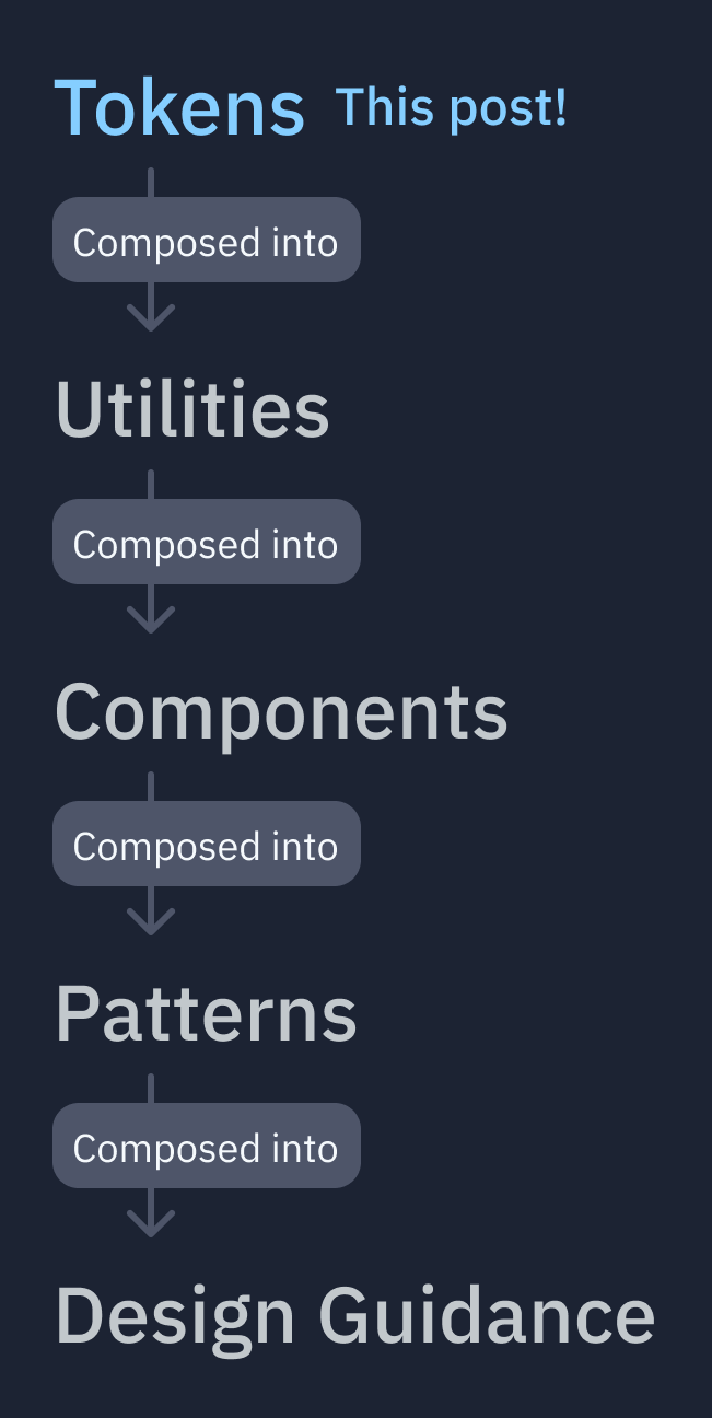
Each layer is a set of patterns that are used to compose the layer above it.
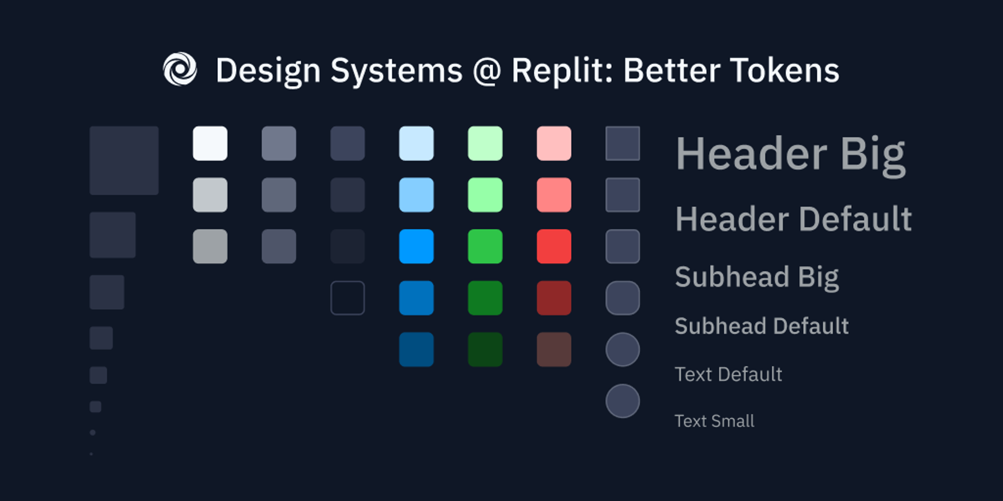
We started with the most primitive layer: tokens. Tokens are just core visual attributes that we can apply in design tools (Figma) and on in our codebase (CSS). They describe appearance, but don’t describe behaviour. Here are some examples:
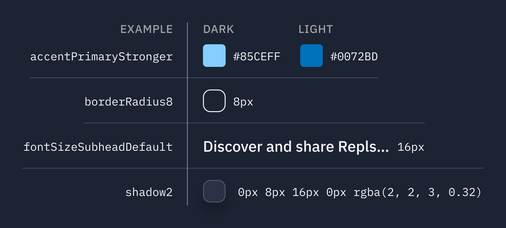
Having a clear, predictable, and easy-to-learn set of tokens is important because it helps us create new interfaces quickly, and lets designers and engineers speak a common language.
We have tokens for:
- Colors
- Spacing sizes
- Font sizes
- Font families
- Font weight
- Line-height
- Drop shadows
- Border radius
We had a rough token system in the codebase already, which was a great place to start from (compared to setting values manually.)
That being said, there were lots of ways we improved the usability of the system we had:
Clearer Naming
Before:
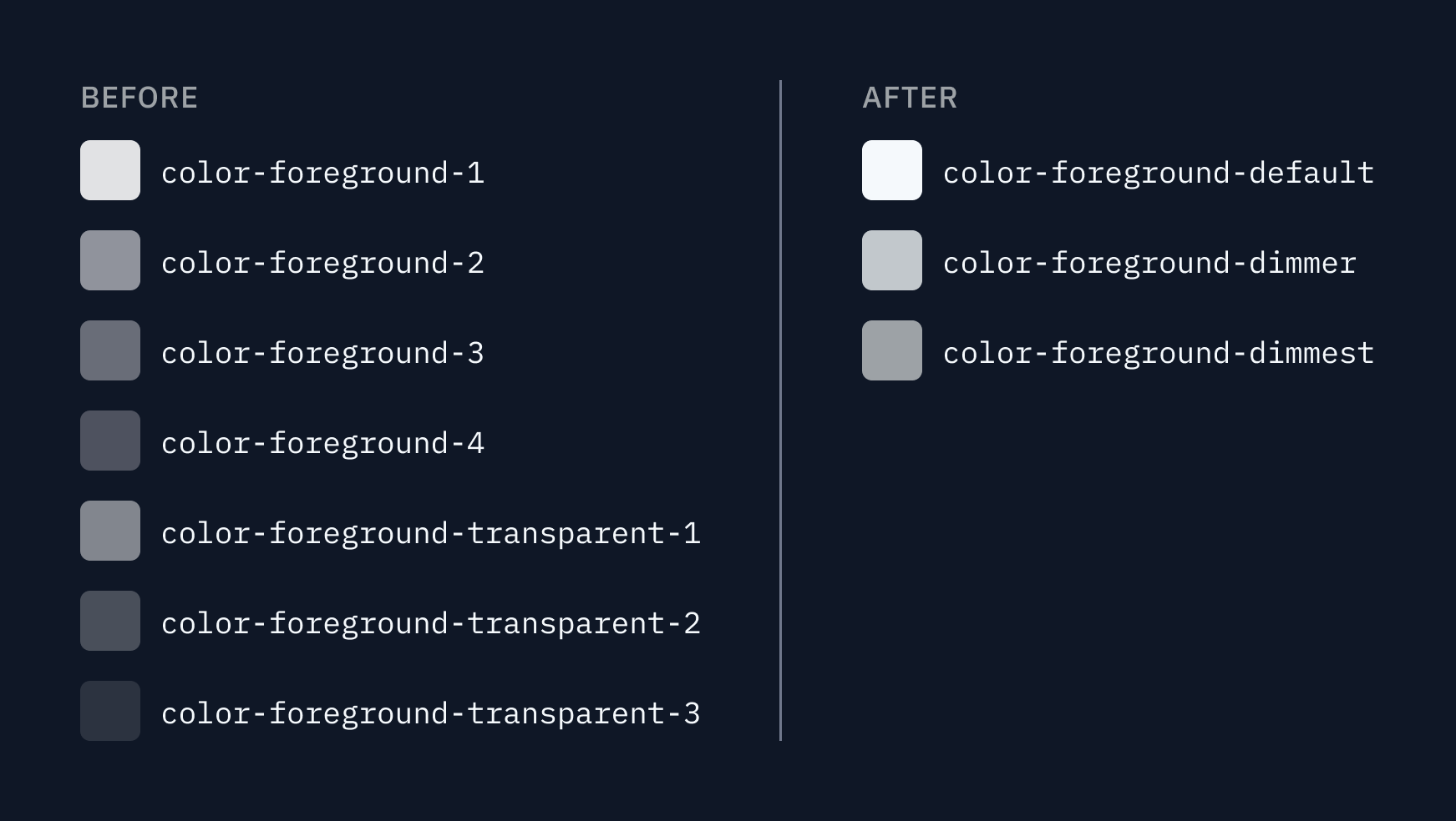
Lots of our tokens were named by number. Like the color tokens: foreground-1, foreground-2, foreground-3, etc. What's the problem with this? Well, when you see foreground-3 in the codebase, it's unclear what that number means. Does 3 refer to… how dark the color is? How saturated it is? Does the scale start high, or low? What do I use most of the time?
We also used arbitrary titling, like font-size-medium. What's medium? Is that like… medium for text, or medium for headlines? Medium compared to what?
After:
For tokens without a clear numeric measure, we named them after their intended use. For example, foreground-default & foreground-dimmer as opposed to foreground-1 & foreground-2.
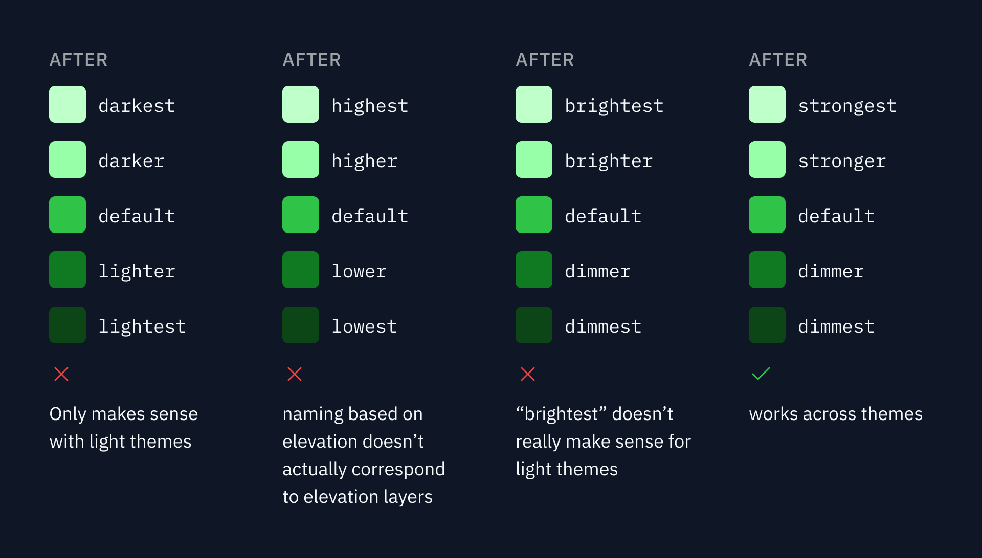
We debated lots of different naming approaches, especially for the color scales. Should the color scale be lowest → highest? Dimmest → brightest? 100 → 900?
The two concepts we wanted to capture were "How much contrast does this color have compared to the background?" and "What elevation does this background color belong at?"
We settled on a "dimmest → strongest" scale for most colors, because it works across themes:
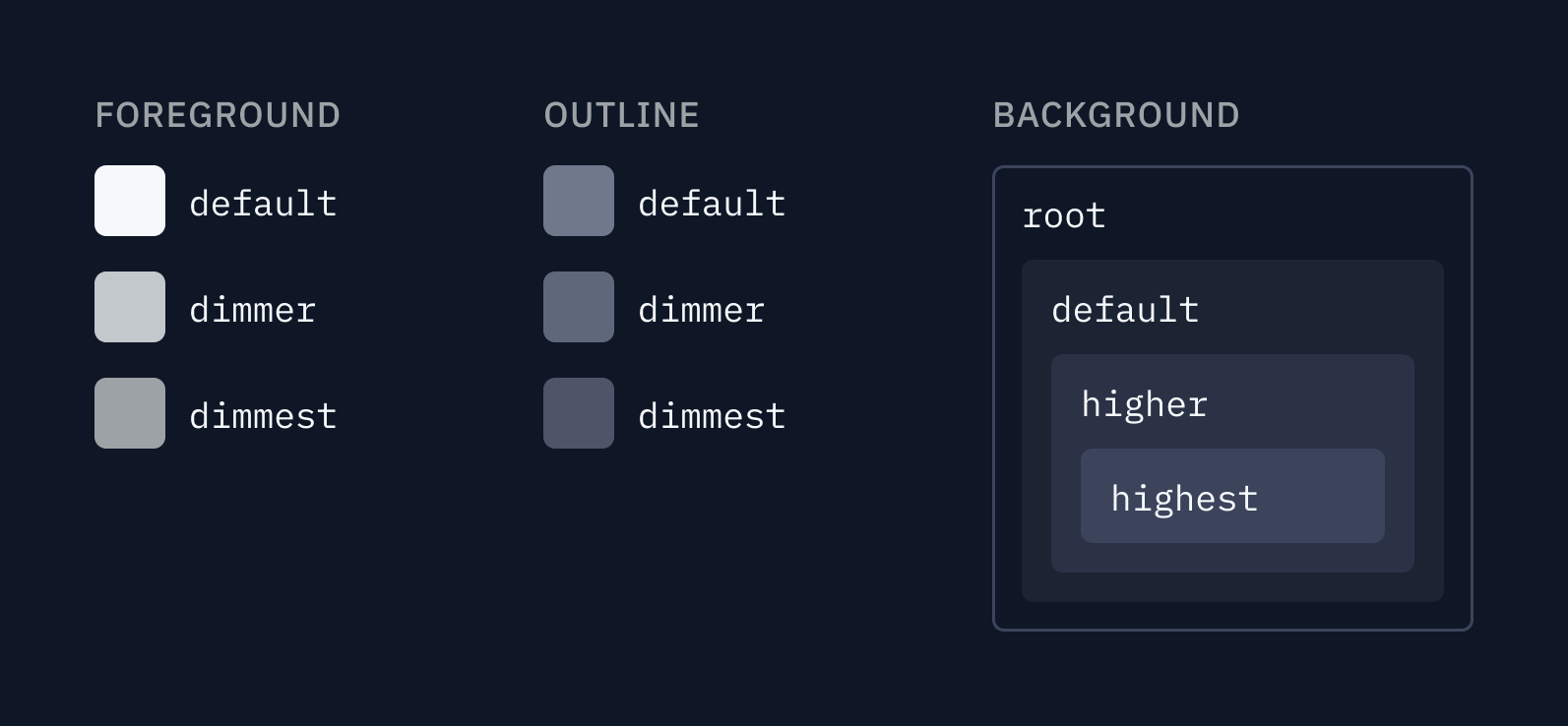
And for core colors, we used the same "dimmest" scheme, but use elevation (from root to highest) to distinguish the background colors. The primary motivation for changing background colors is to place elements on a higher or lower elevation layer:
For tokens with direct measures like px, we named them directly after the measure. For example, font-size-14: 14px instead of font-size-medium: 14px. No guessing!
Number of tokens
We also had lots of tokens. So many tokens. Some that weren't used anywhere in the codebase! It's good to be prepared, but every additional token means more cognitive load when deciding which one to use.
We started with 83 tokens, and trimmed down to 72 while adding categories of tokens we didn't have before, such as line-height and border-width. We eliminated tokens that weren't used or were rarely used, and made sure each token was visually distinct.
Strict typing
Before:
We also had another problem — typos! Because all our tokens were implemented through raw CSS variables, you wouldn't get a lint or compiler error if you mistyped a variable. I personally cleaned up somewhere between 30 and 50 typos.
Some of my favorite typos:
var(--sapcing-1)var(--var-color-control)var(--font-size-deskptop-text-medium)var(--coloe-foreground-1)var(--color-bacjkground-2)
After:
Now, we use emotion to provide a CSS API to our components. We export all of our tokens as an object we can access across our files with vars.tokenName (for example, vars.fontSizeDefault), which comes with easy autocomplete and throws errors if you mistype.
We're probably writing another post that dives deeper into this topic, so stay tuned!
Try it out!
Want to try our tokens? See how we use them in production? Fork this repl and play around with our token playground!
Outro
All good things are done in groups. This work was done primarily by myself, Tyler Angert, Alex Kotliarskyi, and Ashlynn Levenick.
We're still working on RUI — design systems are never done! So keep your eye on the blog for more posts about RUI :)
Want to learn more about design systems in general? Check out designsystems.com
