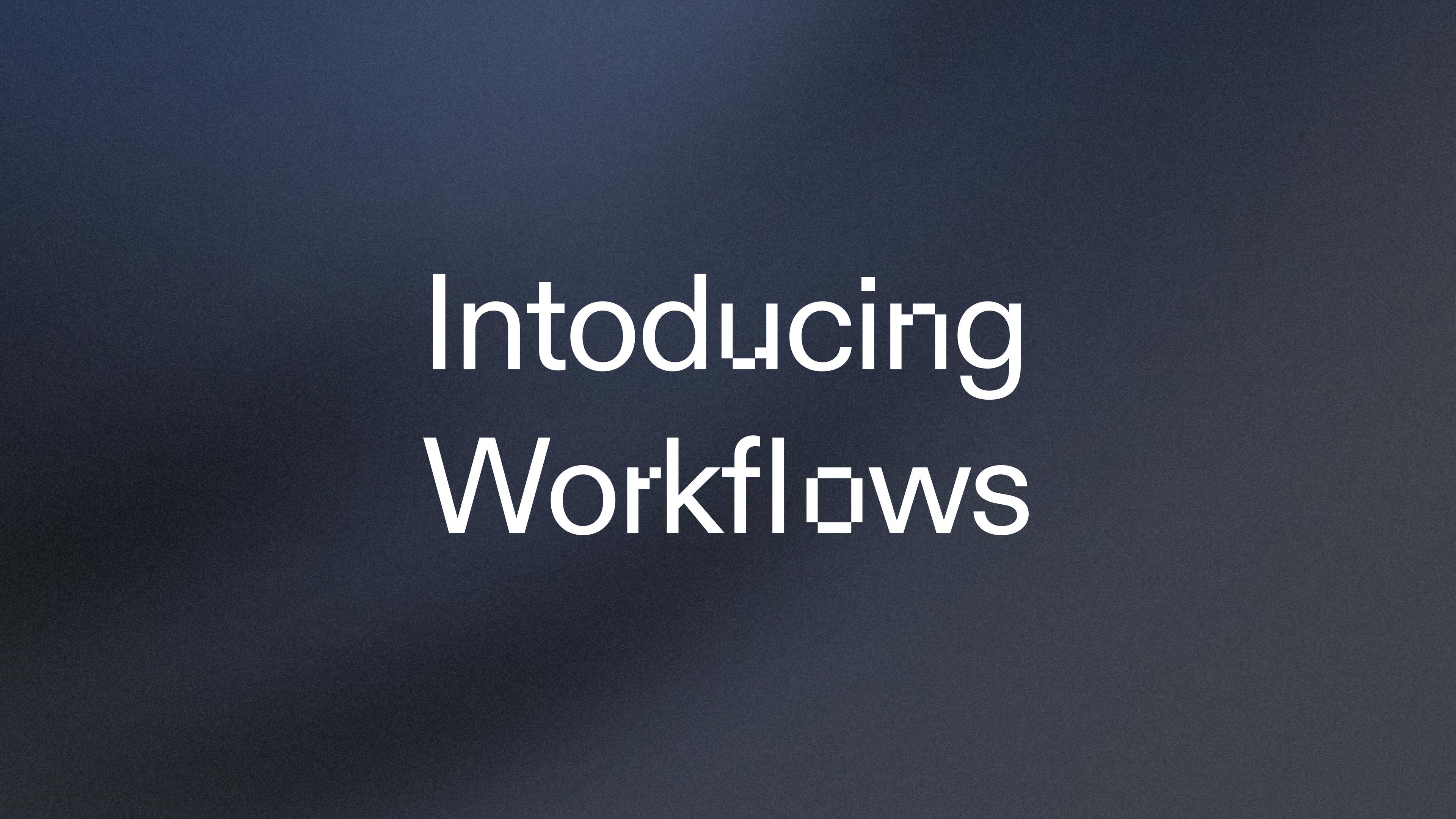
At Replit, AI isn’t merely a footnote to our work. Our mission is to democratize software development, and AI is a step change in our ability to do so.
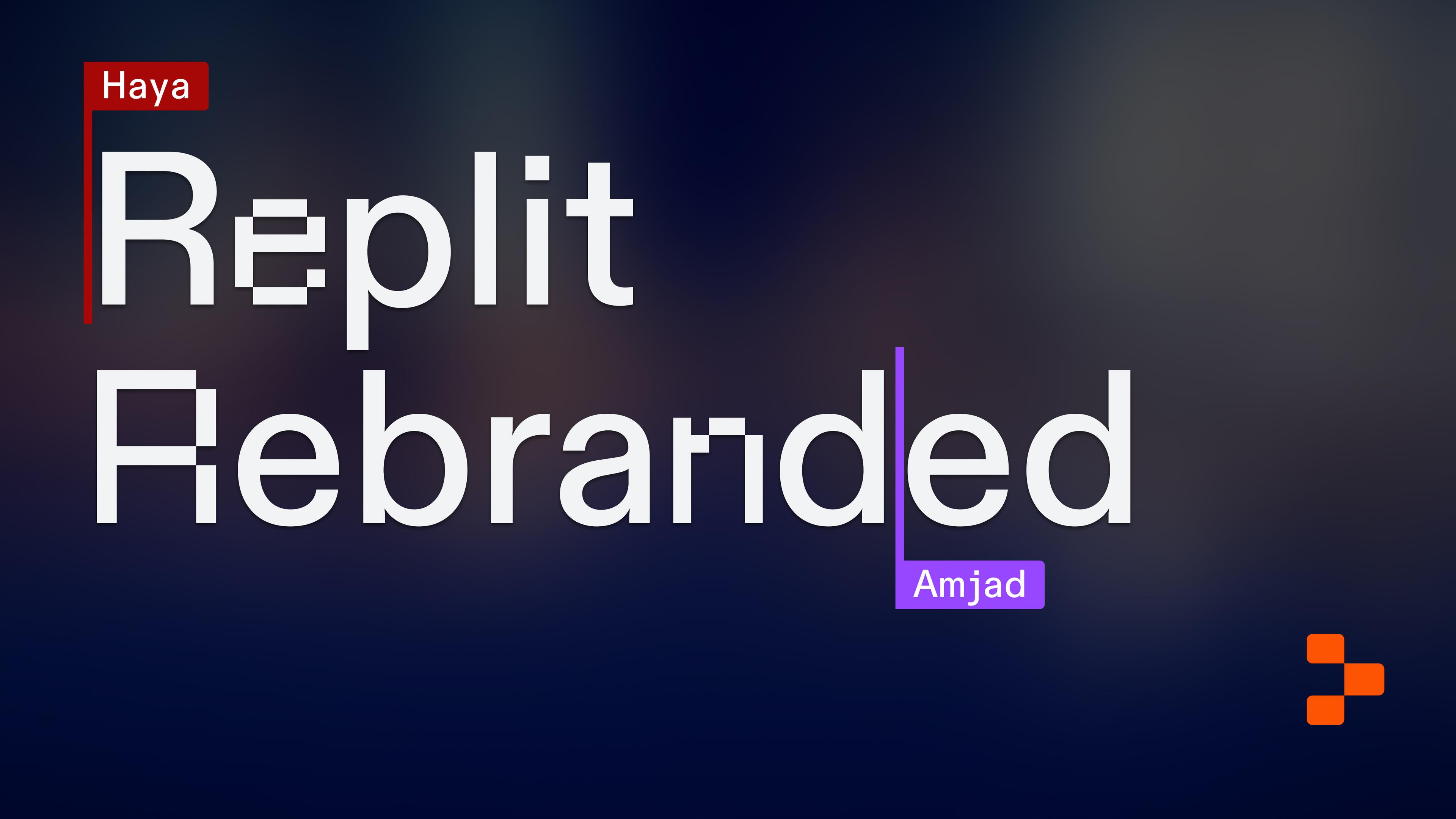
The scale of this change was so significant—both for our company and the industry at large—that we realized we had to explore and refine the Replit brand. We had a lot to say in a market that was becoming increasingly noisy.
But we had a problem: The previous design didn’t quite capture the history of our industry or our company, and our brand needed to demonstrate both to communicate a compelling perspective.
As we refined, we worked from two parallel histories: The history of Replit and the progress we’ve made helping software creators go from idea to software, and the history of computer science and the progress the entire industry has made, ranging from the earliest mainframes to the most powerful LLMs.
We planted our starting point years before Replit was founded
As we’ve built Replit, from its earliest versions to our current AI features, we benefited from the work of people before us. There’s a confidence and humility to knowing this, that we’re proud of our work and grateful for the work that made it possible, that we wanted to translate into our brand.
We have a role in the future, but this confidence comes as much from the work that came before us as from the work we’re doing now.
The breadth of the idea led us to broaden our inputs. We discussed the problem, opportunity, and concepts we were exploring with a wide range of developers, software creators, and designers.
We welcomed how heady these conversations sometimes became, but throughout, we tried to keep returning to the people behind the revolutions. If we’re talking mobile, we’re talking about Steve Jobs; if we’re talking mainframes, we’re talking about Fred Brooks.
The hype around generative AI today is palpable, and we wanted to balance the excitement of all the new opportunities AI brings with the history that’s made it possible. If we’re in an AI summer today, then we owe this bloom to the AI winters that came before us.
As we sketched our exploratory design work, we mapped out three core ideas:
- The sacred history of software development: Replit is building on the work of others, and as the industry evolves, we owe much to the people who came before us. From this history, we drew the raw material that supplied the rest of the work.
- Code as language, and language as code: Replit, as proven in the product and demonstrated through the design, shows that language and code are deeply interrelated and that this interrelation is only growing closer. From this idea, we could create an aesthetic that would frame the rest of the work.
- Pixels, characters, and the atomic units of code: Replit can take software creators from idea to application, so we wanted to center the most atomic units of software – pixels and characters. From these units, we could build the typography that would communicate our message to the world.
These three ideas flow from the conceptual to the tangible, from raw material and inspiration to the typographical elements, colors, and visuals you see today.
Embodying the history of software in our vision
The history of software development formed the most conceptual level of our work. We couldn’t capture every idea, person, and iteration that came before us, but we wanted to contextualize what Replit is building at this specific moment and show how our work echoes similar moments in time.
It bears repeating, but the launch and popularization of generative AI is a historic moment for the industry and, likely, the world. A brand at the forefront of this change can’t pretend we got here on our own, nor can it downplay the significance of its role in the moment. Instead, we relied on history to show that Replit (and the industry) is transitioning from what’s possible to what is.
The timeline starts in the early sixties and continues through the seventies, when the pace of software development picked up significantly. Luminaries like J. C. R. Licklider, Ted Nelson, and Frederick Hammersley carried us through the 1980s, from the invention of Photoshop and the Internet to the Blender Foundation to open-source projects and communities around games like Minecraft.
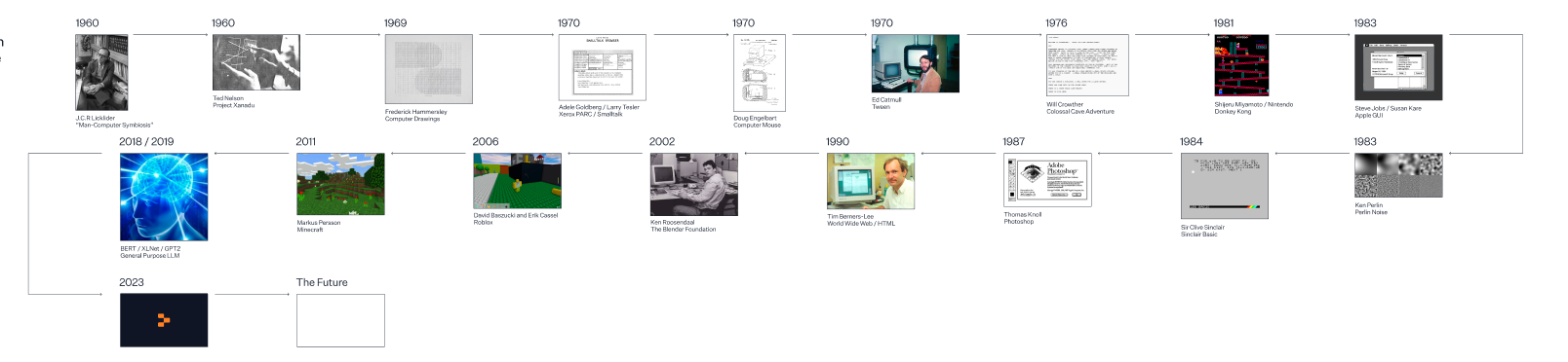
The history here is diverse, taking on many new ideas and turning in new and different directions, but throughout, the ability to access software and build software has always become more and more available to more and more people. If there is one single throughline, it’s democratization.
LLMs, in this context, are a development of this history, not a break from it.
Computers used to take up entire rooms but can now fit in our pockets. ML/AI models used to need huge compute resources to run but can now be accessed via the browser. It’s the same pattern.
In another parallel change, computers have transformed from devices exclusive to research and academic institutions to devices usable by non-technical end-users. Similarly, the expertise of technical experts is being condensed into LLMs that are increasingly accessible to anyone and everyone.
The timeline shows our audience that it’s late enough for them to start building with AI but early enough that nobody has figured out what will be built. It’s a new frontier, and we’re giving them the tools to chart their own paths.
Code as language and language as code in our visual identity
The hinge for this work, which lies between the most conceptual and the most tangible, is the idea that code is language and language is code.
The least technical user and the most experienced developer intuited this idea, on some level, when they first booted up a tool like ChatGPT and watched it turn a natural language inquiry into something novel and new.
Even if your sense of what’s going on behind the scenes is dim, you can tell that your everyday words are becoming code. With ChatGPT, the code returns new words, but the possibility opens wide: When natural language can become code just by speaking or typing, a whole new world opens.
As Andrej Karpathy, part of the founding team at OpenAI, has said, “The hottest new programming language is English.” We’d only add that the hottest new programmer is the software creator who learns how to work with their words and with AI as first principles.
Over time, the divide between “hard” skills and “soft” ones, the technical and the non-technical, development and design, will become much more permeable. AI, as the connective tissue between natural language and code, bridges the divide.
This perspective was important to us because many companies are telling purely technical stories about hardware and the capabilities of various models. Often, this doesn’t result in a vision but results in telling a product story or retelling an AI story. Instead, we wanted to focus on the people crossing the boundaries between language and code and then back again.
As we refined this realization, turning it into visuals, we quickly decided against things we didn’t want to do.
Off-the-shelf imagery was the first thing we rejected. We wanted to avoid easy, overdone imagery that risked creating an aesthetic that felt “default.”
Instead, we tried to capture the energy behind the generative nature of AI – the energetic movement that stretches from the earliest computer scientists pioneering new ways of thinking to modern hackathons filled with developers hacking their way toward the future.

In the AI era, the last thing you can be is default.
Pixels, characters, and the atomic units of code in our typography
Once we realized language, code, and logic were interwoven, we thought about what code really looks like and what it can evoke. This realization led us to the anchors for executing the design: The pixel and the character.
Transitioning from the conceptual to the tangible was the biggest challenge initially. We knew what we didn’t want to do, but the page was blank for what we wanted to do. When we came back to the previous stage, however, and thought about code as language and language, it became clear.
More parallels emerged: Just like we can’t understand where we are today without understanding what came first, our design needed to start with the atomic units of software work: Pixels and characters.
The pixel, perhaps more than anything else, is typically meant to fade into the background. The pixel is rarely given top-billing, and in most cases, the visibility of pixels in a design – as necessary as they are – is usually evidence that the design isn’t high fidelity enough.
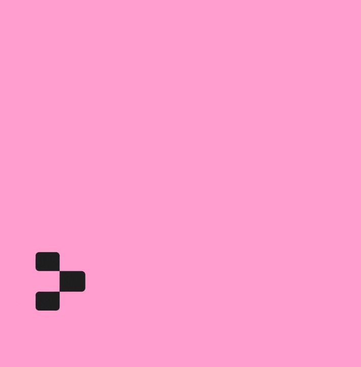
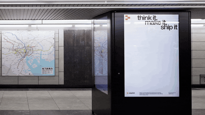
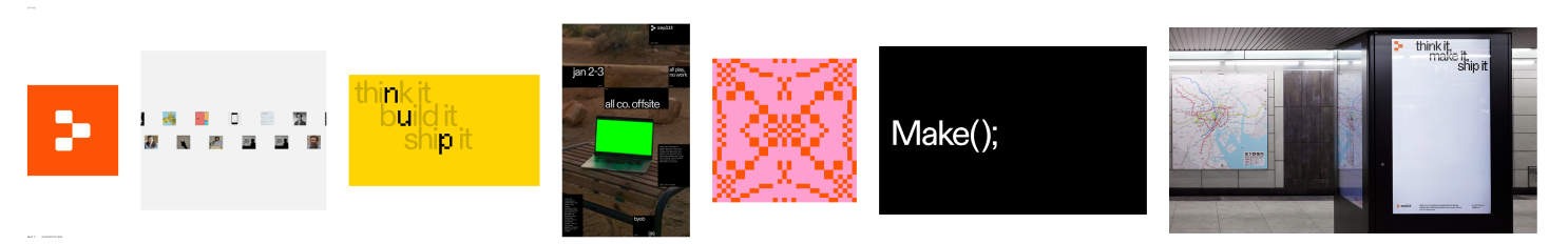
In this case, we wanted to foreground the pixel. The pixel is front and center in our logo, and we’ve threaded it through every element of the work.
If the pixel demonstrates a visual building block, the character demonstrates a logical block.
Characters are how developers type and represent code in a code editor. Communicating this idea via monospace fonts was an obvious idea that we immediately rejected. These fonts do have a strong association with software development, but they tell a simplistic story about the world’s relationship to technology.
Of course, because we’re trying to tell the story of computer science through our history, we also couldn’t rely on fonts that, by definition, weren’t unique. Anyone can use them, and many do, so we didn’t want to risk their impact diluting over time.
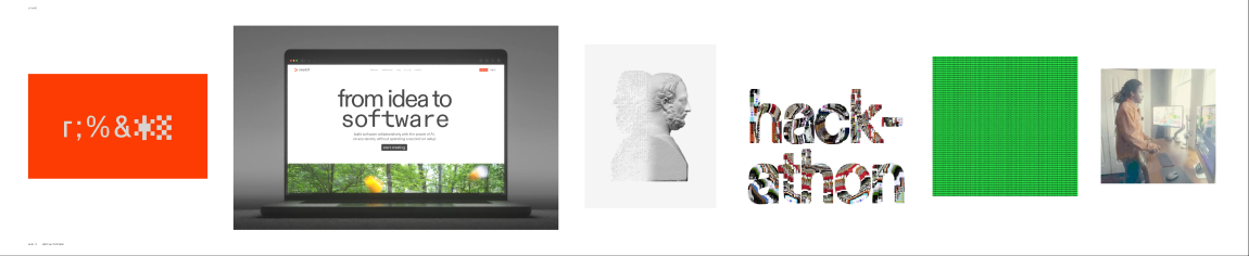
Instead, we needed to capture both the character as it is and the human behind the character, so we drew the pixelated font by hand. Will every user know this? No, but it supports a consistent message we repeat throughout our work: There’s always a human behind the machine.
From pixels and characters, we worked backward from typography to illustrations, shapes, layout, motion, and color. With color, for example, we saw many other designs focusing on how screens display color and how computers render color. With our design, we focused instead on how humans perceive color.
The more we turned the conceptual into the tangible, the more we saw our original vision come through. When we finally started rendering headlines on the website, we knew we had done it – a fusion of the humanistic and technical elements that codified all the work we had done and all the work yet to do.
We stand on the shoulders of giants
The core realization behind our brand exploration was that Replit’s story reflects and contains the software industry’s story.
- The industry created and distributed smart mobile devices; we made it possible to build software on those devices.
- The industry developed LLMs; we turned AI into a partner in code to help software creators build.
- The industry built the software developer role; we are on the path to turning everyone into software creators.
In our final look, we hope you can see how and why both stories need to be told at the same time. It’s only through the coexistence of each history that we can tell the brand story we need to tell.