
If you've been on the Repl.it landing page recently, you may have noticed a bit of a change!
We spent a few weeks revamping our marketing pages and wanted to share a few words about how it went. A lot of design and engineering iteration went into not only making our new pages look great, but also creating a scalable and maintainable system.
Our process
Motivation & setup
Naturally there were a lot of questions about where to start this redesign: the tone and voice of our copy? The visual style? The product we were advertising? Where the product was going to be in a few months?
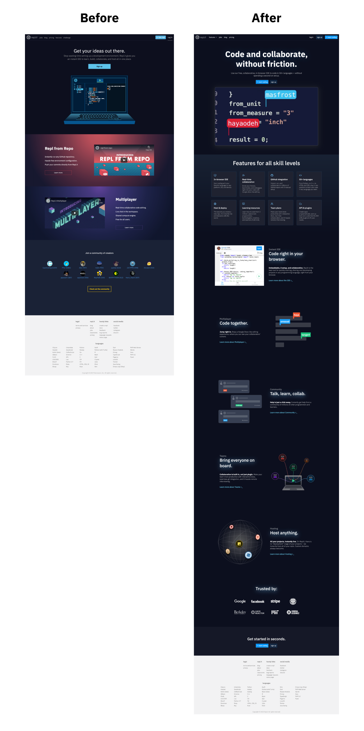
Ultimately this project was primarily motivated by growth and product education. For example, our previous landing page led with "Get your ideas out there", which is a great message and definitely part of our vision, but says nothing specific about the product. We wanted to approach the redesign not only as an opportunity to refine our visual and brand identity, but to get Repl.it out to millions more people and make the product dead-simple to understand.
We are a small company and Repl.it evolves rapidly relative to more mature products. It was clear from the beginning that this project wasn't about glowing text and nice illustrations; it forced us to focus on the main value proposition of the product and prioritize which features would be at the forefront of our brand. We also needed to set up a scalable framework to support information about future features, let us add and remove features easily from any pages, and let us create assets quickly and consistently.
Information architecture & copy
To help us out with the initial part of our design process, we hired the talented Neil Shankar to lead on information architecture, auditing, and writing our initial copy.
The first step of our process involved a basic audit of the current landing page. This would set the stage for the rest of the feature / use cases pages since they basically repeated the landing page's layout.
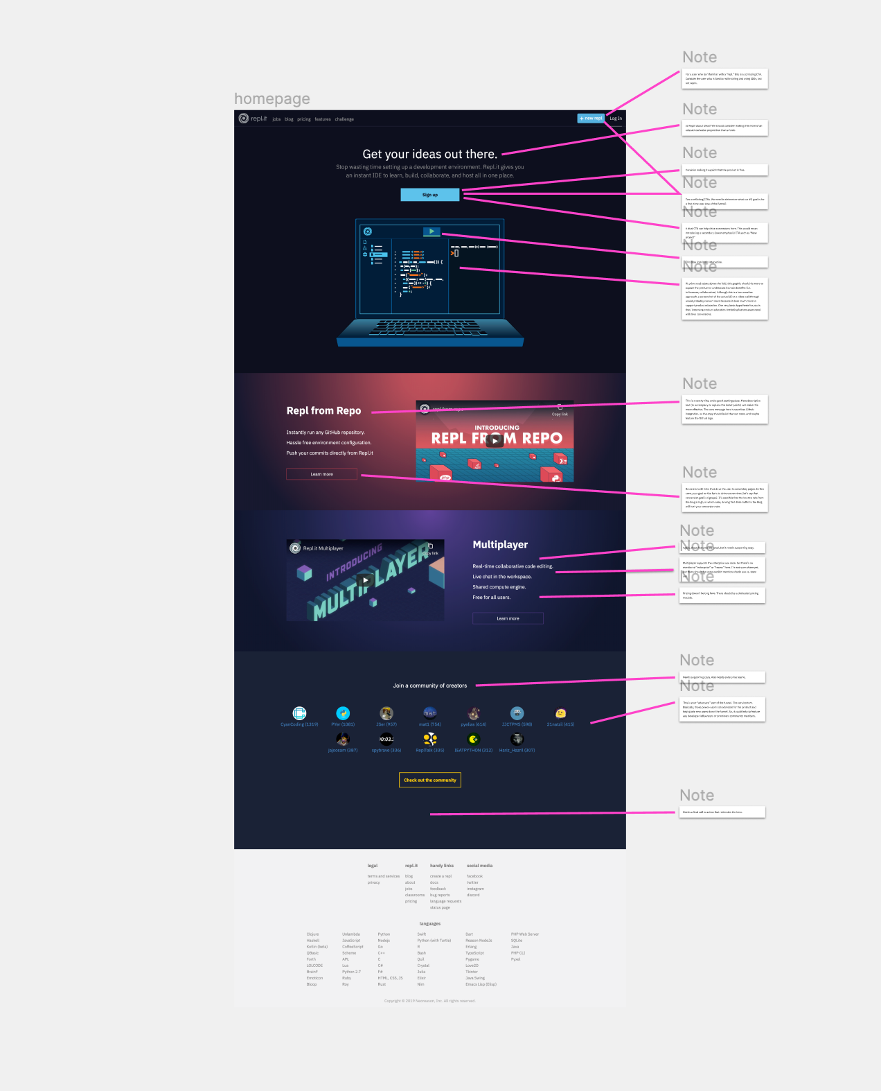
After the audit, we realized we needed to focus primarily on one thing: consistency. We got to the drawing (writing?) board and began to layout what key themes we wanted to focus on, both from a product-level perspective and in terms of SEO. We recorded our top 25 organic keywords, and made a list of potential adjective/noun combinations that we would want to lead towards our site. This list isn't exhaustive, but mainly consisted of:
Adjectives
- Collaborative
- Online
- Browser
Nouns
- IDE
- Coding
- Programming
- Programming language (python/c/c++/html)
- Programming topics (data science, vr, creative coding)
- Algorithms / data structures (quicksort, bubble sort)
- Repl
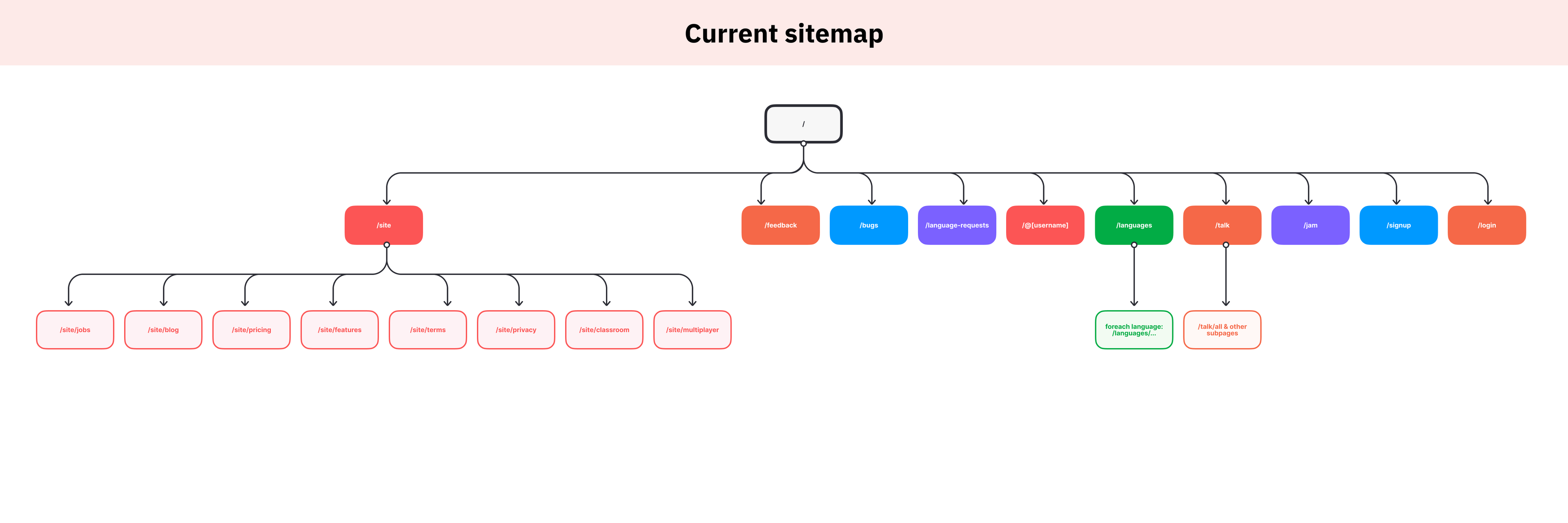
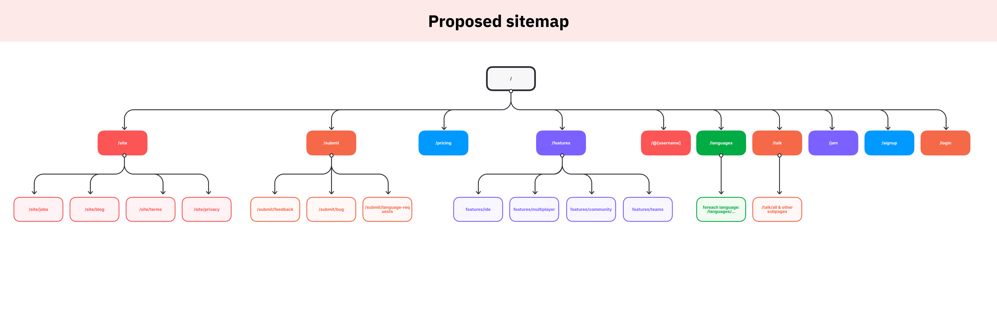
From there, we had a good grasp on the features we wanted to focus on: Instant IDE, Multiplayer, Community, Teams, and Hosting. Afterwards, we were able to analyze the current sitemap and propose a new structure focused on navigating to features.
Before:
After:
Layout & composition
We wanted to keep it simple and scalable. We knew we wanted updates to be fast and be able to adapt to a rapidly changing product, so we couldn't create layouts and designs that were too tightly coupled to specific features.
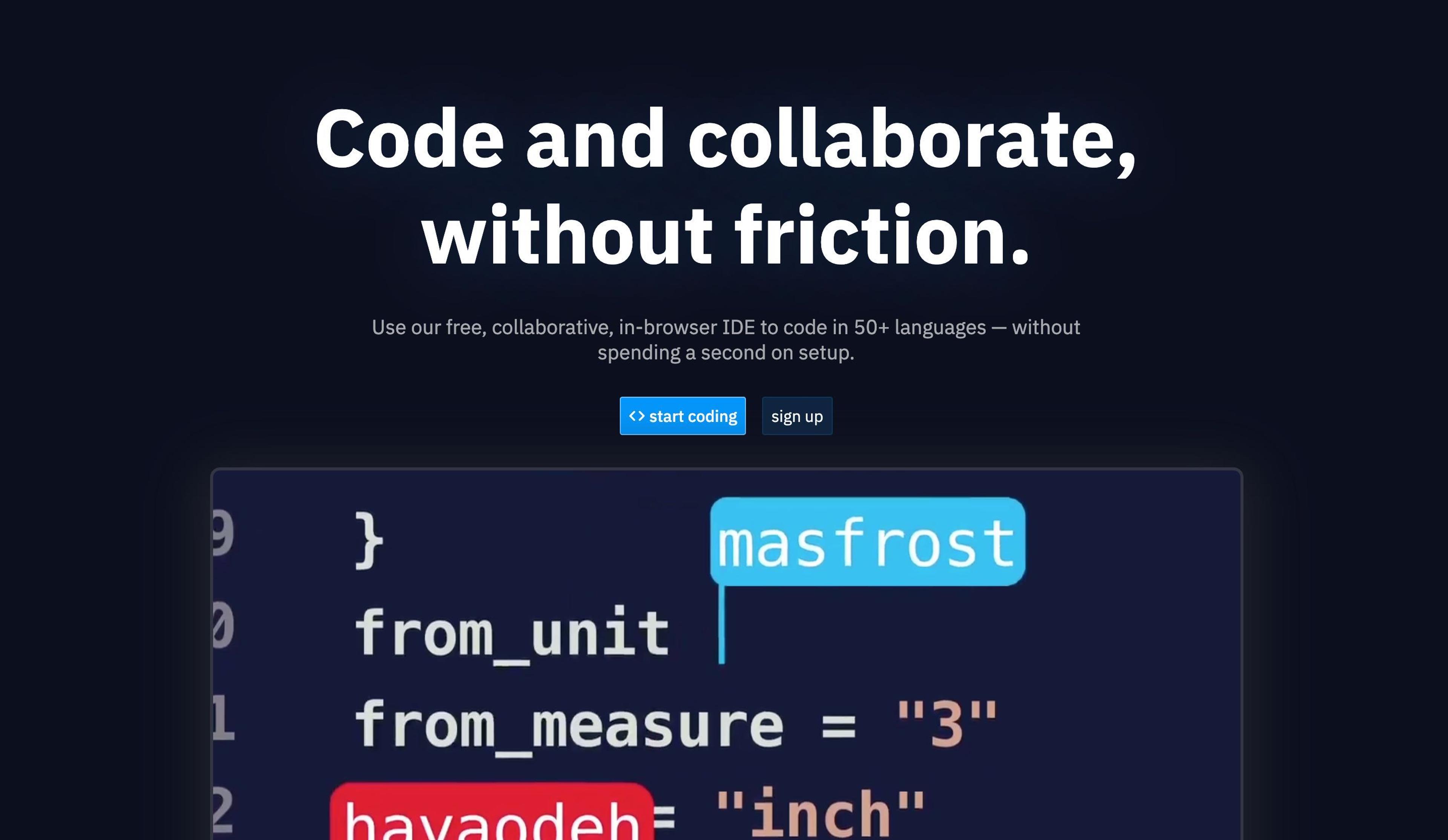
Below, you can see our medium-fidelity mockups for all of our feature pages. They largely consist of two components: a hero section with two strong CTAs (calls to action)-- start coding and sign up-- and various feature sections that alternate the location of their asset and text content.
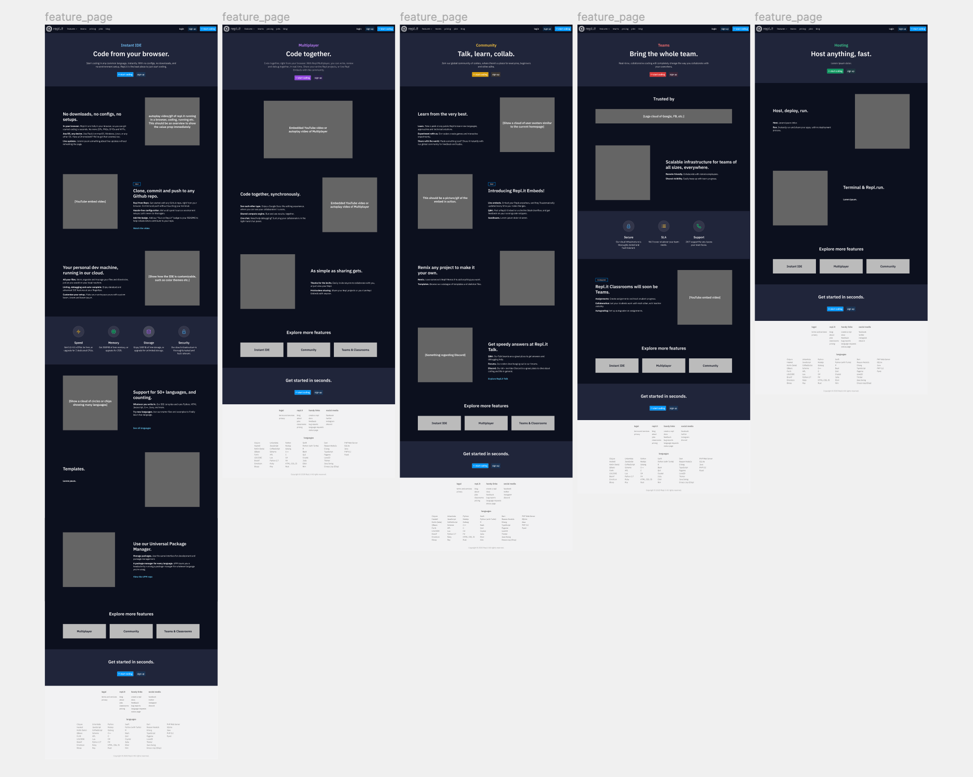
Illustration & assets
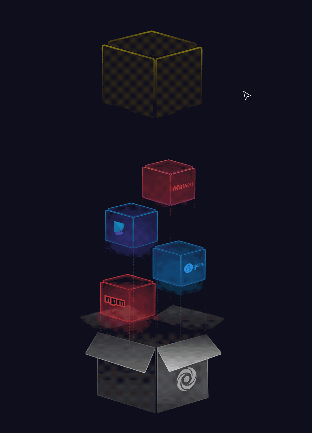
I am definitely not an illustrator by trade, but I do enough in my spare time that I felt comfortable making all of the assets. I wanted to take a more component-based approach to our illustrations so we could make new assets more quickly and consistently.
We use Figma extensively and for basically every design related task. This includes our UI design, UX design, brainstorming, basic animations, and all of our new illustrations. We are also planning on making several plugins to make designing programming interfaces easier.
Where Figma came in handy, apart from its collaboration features, was components and auto-layout.
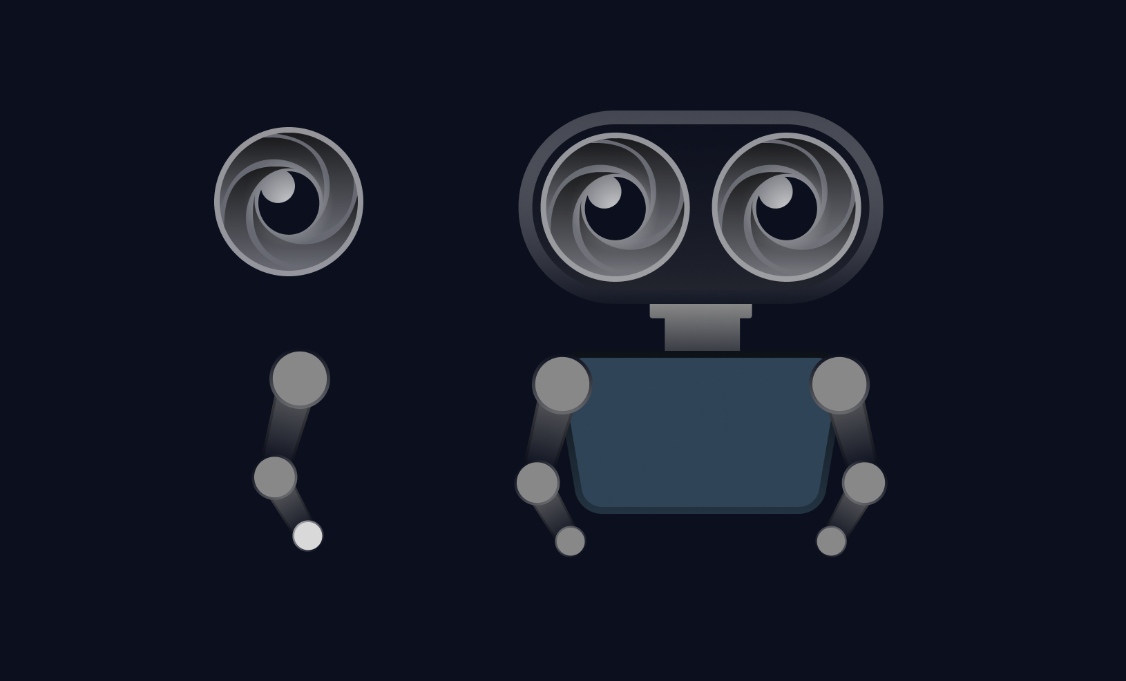
So, not only were we able to design our little robot mascot using components...
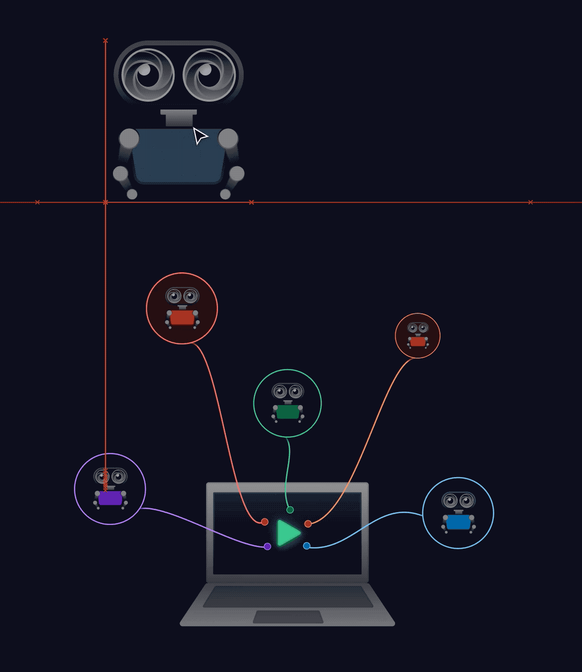
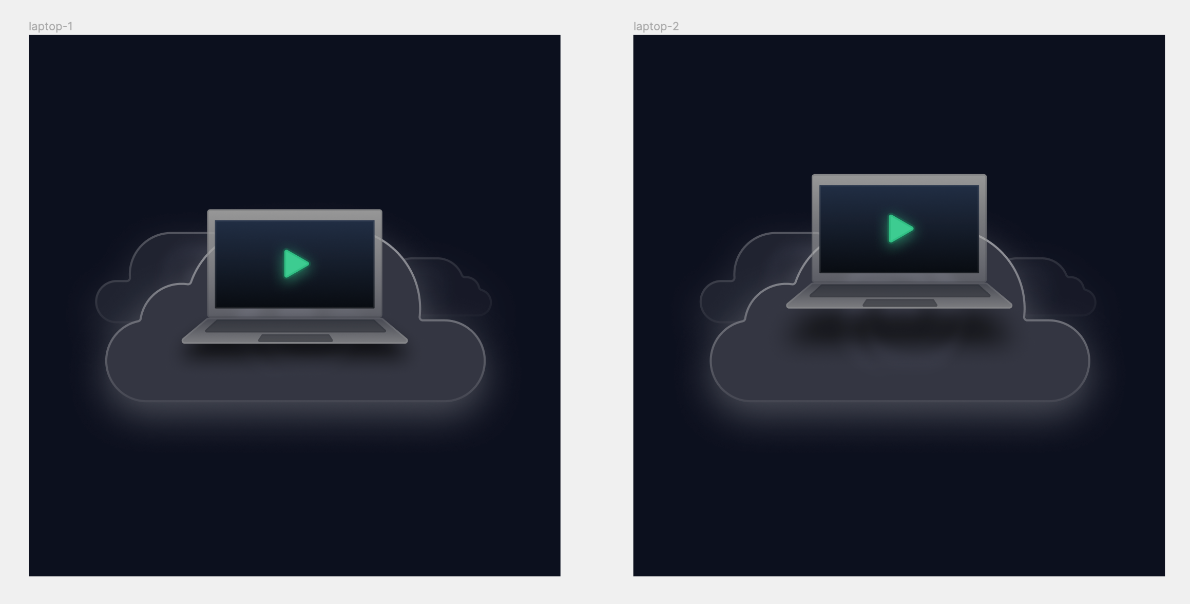
But adding auto-layout to the robot and other assets made changes like these smooth and easy:
Their new smart-animate feature also allowed us to make this animation, which we use on the IDE feature page, by just interpolating between two frames:

Needless to say, we're huge fans of Figma and it's a core part of our entire design pipeline.
Our own headless CMS
I've already written about using our own headless CMS on Repl.it here. Here's the tl;dr: we write all of our content as JSON files in our CMS repl. Then, each marketing page template requests the JSON, renders the appropriate component based on the "type" of the content block from the JSON, and voila! You've got instantly updatable marketing pages, all self-hosted and easily scalable.
The results
All in all, the redesign can be summarized well by this before/after shot, and we couldn't be prouder to release it to the public. You can check out the rest of the marketing pages more in depth here:
As Repl.it evolves, you can expect to see more of this vaporwave inspired aesthetic throughout our branding and UI. And if you're a talented generalist designer who loves to work on UI, UX, and graphic design, please reach out at [email protected] with your resume and portfolio! Bonus points if you've got a penchant for programming tools and coding. :)
(If you know anyone who might be a good fit, let us know as well!)