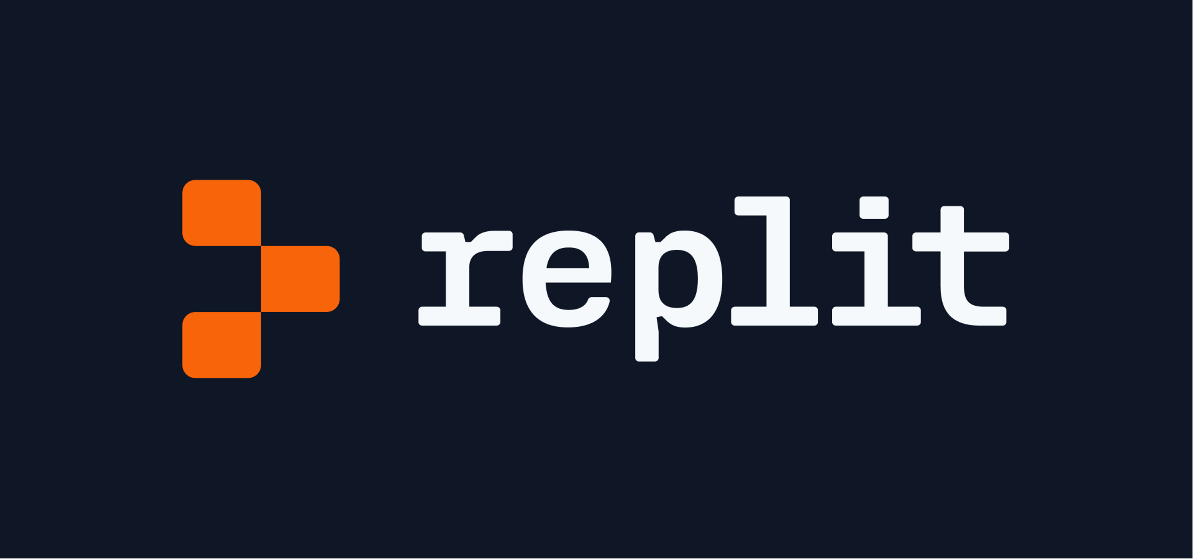

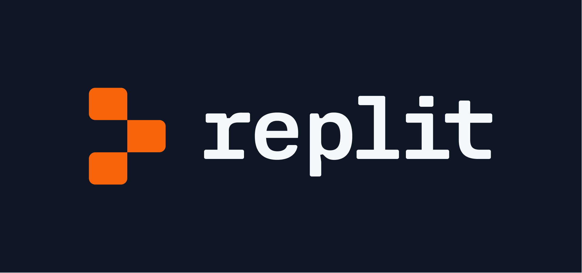
You may have noticed that Replit's logo looks a little different than it did last week. In summary: we're using what we call the "prompt" we already use elsewhere as our primary symbol. The prompt gives you an empty canvas, full of possibility, for you to start creating. We want Replit to be the same for your software creation journey! Let's dive in and learn why.
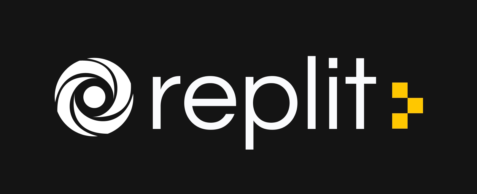
We've had our old logo for a long time. The symbol (loopy, or hurricane, or ripple, or whatever else you call it) has served us well, but for a few reasons we wanted to simplify how Replit is represented:
- It's hard to draw! Iconic logos you remember easily (Nike, Apple) are easy to reproduce. Even a five-year-old can draw the Nike logo.
- It was unclear what it stood for.
- It was originally drawn with imperfect geometry — look closely and you'll see that it's not actually symmetrical and the gaps between shapes are inconsistent.
- Because of that, it doesn't render well at small scales.
- We didn't do many checks before using it. It turns out a lot of existing logos are similar! Even in the coding tools market, others use similar symbols.
Plus, to make matters more complicated, we've been using our "prompt" (the three yellow dots) in more places, sometimes alone. For example, we use it in our logotype, or our merch; so the question of "Wait, what's the actual logo?" came up often.
The prompt started in the Replit interface as the place where you start interacting with the Console or Shell; it's literally "where you start creating". Prompts look different across the computing ecosystem, and this is our take on it.
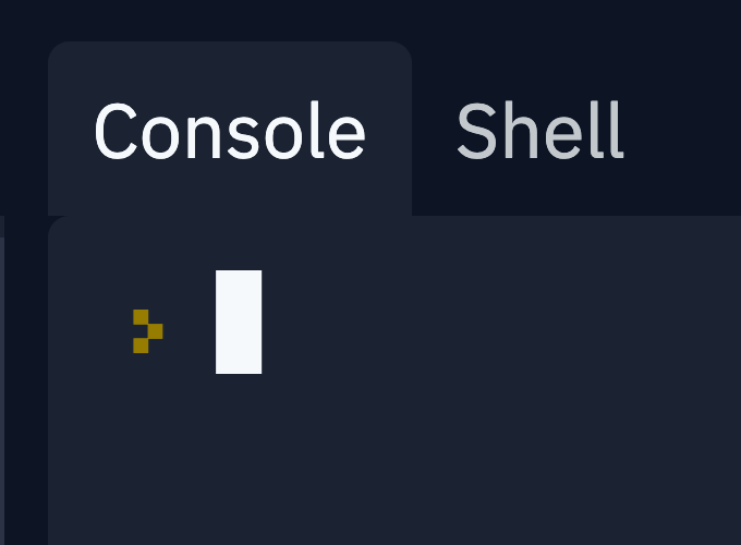
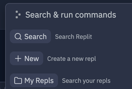
We also started using it in other places where someone might start typing a command, even if they weren't traditional consoles or shells, like our search/command bar:
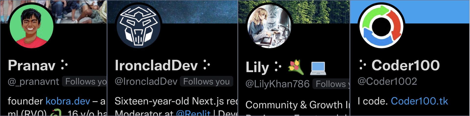
After we introduced this prompt, interesting things happened. Some Replit users started using it to express themselves on Discord, Twitter, etc. (Most of them used a unicode character to simulate the prompt — U+2815, or "Braille Pattern Dots-135"). As any brand designer knows, if people pick up your symbol and start using it themselves, that's pretty remarkable.
When we decided to rip off the band-aid and retire the old logo, we explored far and wide. Working with Mackey Saturday and our internal design team, we looked at ways computing has been represented visually, like Michael Beirut's work for MIT Media Lab and Susan Kare's original icon set for the Macintosh. We tried abstracting all sorts of ideas related to computing — keyboard keys, the "run" button in the Replit workspace, pixels, the cloud…
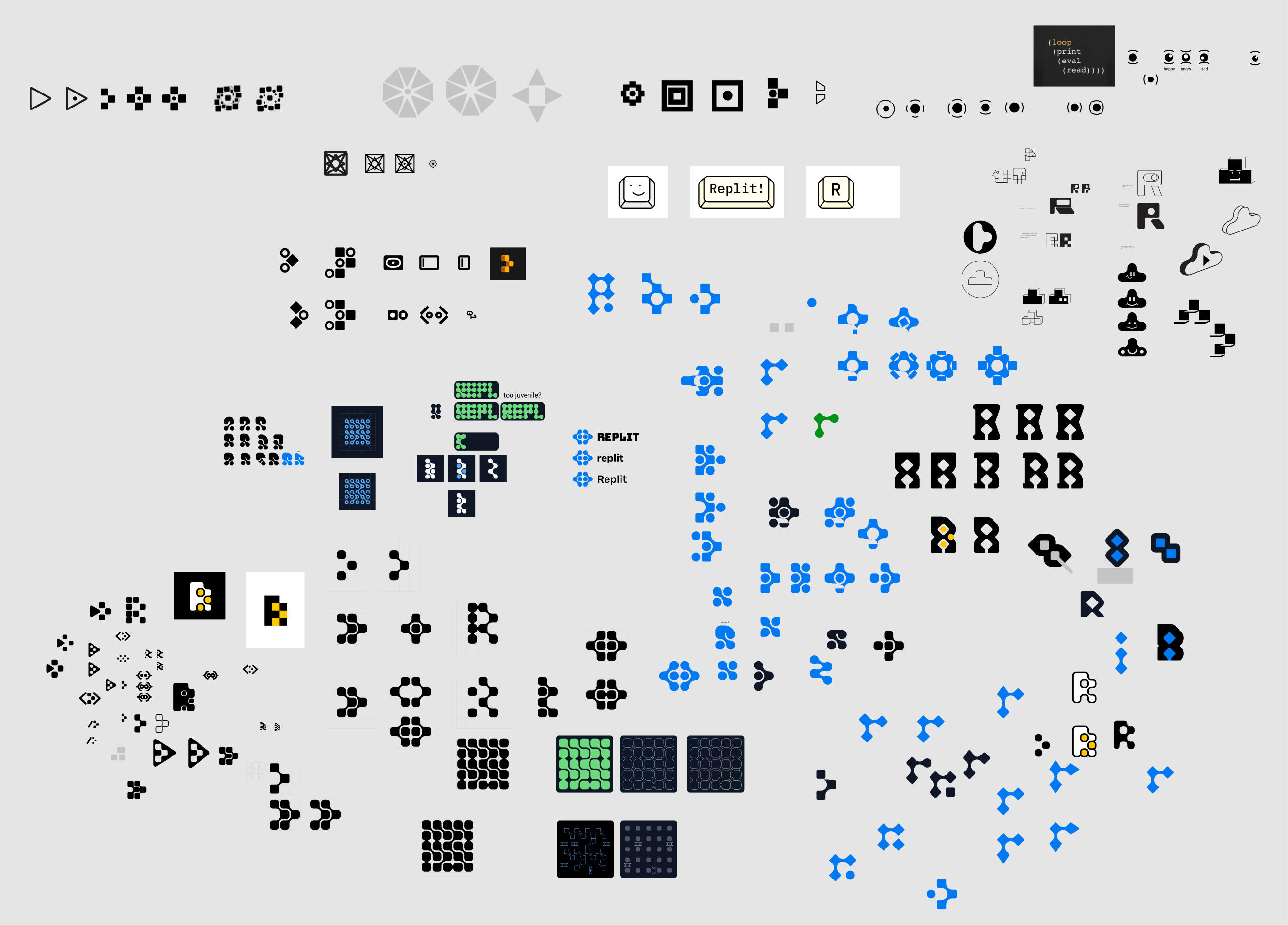
…but in the end, we kept coming back to some version of the prompt. Why?
- The prompt already has equity — people already know it and are using it
- It's easy to draw
- It scales down to small sizes really well
- Its origin aligns really well with our goals. The prompt gives you an empty canvas, full of possibility, for you to start creating. We want Replit to be the same for your programming journey!
- You can construct the symbol with simple building blocks — just three shapes! This makes it easy to remix and build visual systems around. Plus, it's a good reminder that we're in the building blocks (computing primitives) business.
The logotype has also been cleaned up to feel much more computing-y — it's a monospace, which is the type of characters traditionally used in programming interfaces, and has some softer corners compared to our old logotype.
We also settled on a friendly orange for cases where the logo could use color. We drew inspiration from stories of the advent of hacking culture: the PLATO system and its early plasma displays. Computing has had enough blues and greens!
So, that's the story of why our logo looks different today. We hope you see it in the wild and think fondly back to these reasons when you do!
Thanks to Mackey Saturday, the Replit design team, and everyone else who contributed ideas — Haya, Tyler, Omar, Moudy, Joe, Tiga.
If you're interested in helping define the future of how computing looks (and works), come join us — we're hiring!