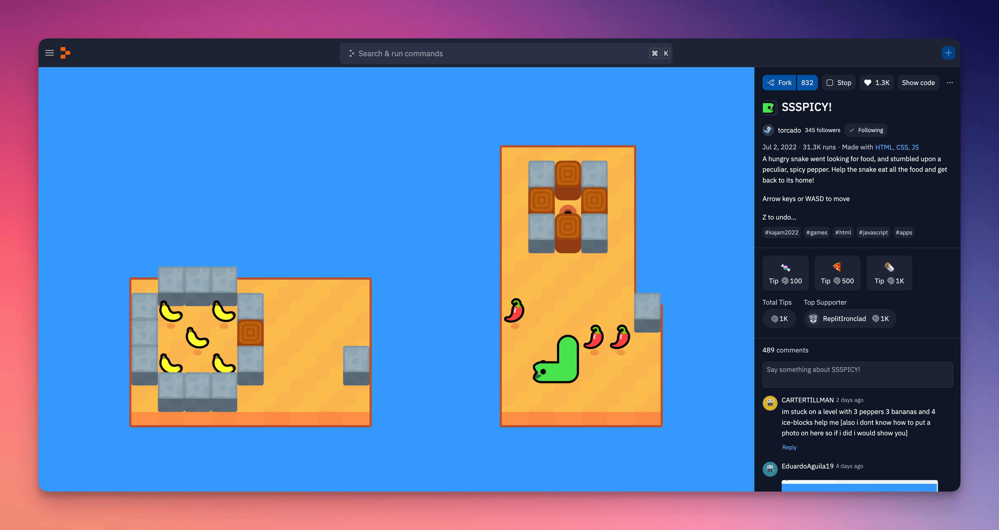
We're excited to announce that Replit rolled out a big visual update to cover pages last week. With this update, Repl content comes first more than ever before. Everything else is now off to the side, allowing for a cleaner and more focused app experience. Our goal with this update is to improve the user experience for both creators and visitors of Replit projects.
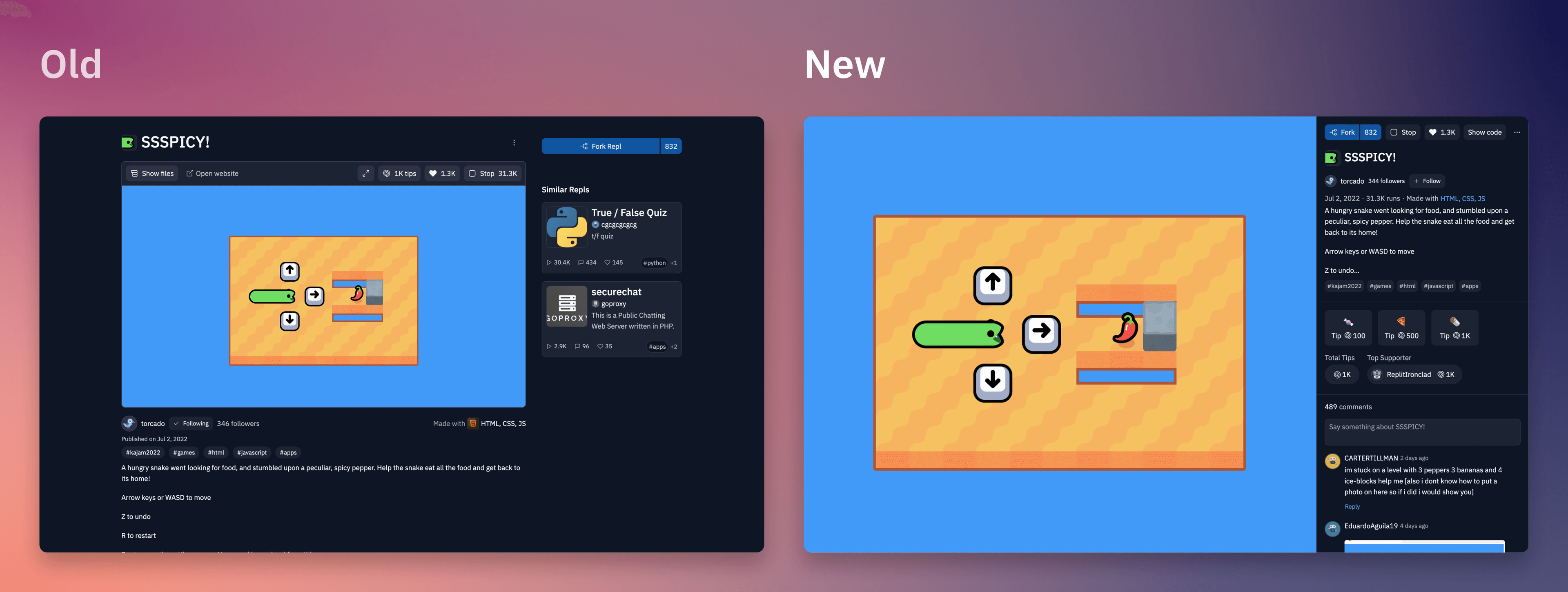
Two key improvements come with this update:
- More space for Repl content: Before, Repl content was constrained to a box that took up a small portion of the screen and had its own scroll context. With the new design, the Repl itself takes up a much larger part of the screen and sits full-height, allowing for more immersive project experiences.
- Improved social experience: Before, if you wanted to learn more about the Repl, leave a comment, or tip the creator, you had to scroll down and away from the Repl, losing your immersion. Now, the sidebar puts all of this important information in immediate reach, making it easier to engage with the creator and other visitors without leaving the Repl experience. In our experiments, we found that viewers of the new cover page design were 125% more likely to leave a tip!
We're confident that this update will be a big improvement for the Replit community, and we can't wait to see the amazing projects that take advantage of the new cover page design!
