
People have expected apps to rotate with their mobile devices since before the introduction of the iPhone in 2007. It’s especially important for productivity apps to adapt and let people choose how they want to utilize their screen space. With the newest version of the Replit Mobile App, you can now code in both landscape and portrait modes. This creates a significantly improved experience on smaller tablets like the iPad mini or larger phones like the Pixel Fold. Want to code on the go with your iPad mini? Simply rotate it to portrait, then later, when you’re home, connect it to your wireless mouse & keyboard and rotate it to landscape for maximal screen space. This is the first of many more improvements to the Replit Mobile App, unlocking your ability to build and launch your next startup from your phone.
Updating the Replit Mobile App to respond to orientation changes required navigating a few key areas:
- Accounting for screen edge insets
- Creating a friendly API for reacting to and inspecting orientation information
- Sizing screen content correctly based on orientation
The Replit app is built using Expo for React Native, and we use the react-native-safe-area-context library to ensure we display UI in the safe areas of the screen. The addition of camera cut-outs and gesture-based navigation to most smartphones in recent years has made it even more important to account for screen-safe areas when building for a wide range of mobile devices. Properly accounting for screen-safe areas means that the app’s interface isn’t shown under the camera cut-out or behind the system navigation UI. Here’s an example with an iPhone 15 Pro: the non-safe areas where the camera cut-out and system navigation UI live are highlighted in red.
We also wanted to maximize screen space for coding. Those familiar with react-native-safe-area-context might notice that the right side of the screen isn’t illustrated as a non-safe area, which is the default behavior. We overrode the behavior to allow for more screen space depending on which side the notch was on. To do this, we implemented a React context responsible for all things orientation. It has observables for checking whether the device is in a landscape orientation, which specific orientation it is in, locking and unlocking the orientation, and getting edge inset sizes.
The last piece of the puzzle was combining all of this functionality and information to observe the device state and adjust the UI accordingly. The most important areas to adjust are the header and the workspace bottom bar. The left and right edges are also adjusted to avoid under-lapping any notches or navigation UI, while the bottom edge is adjusted to be above the navigation UI, and it all updates when you rotate your device.
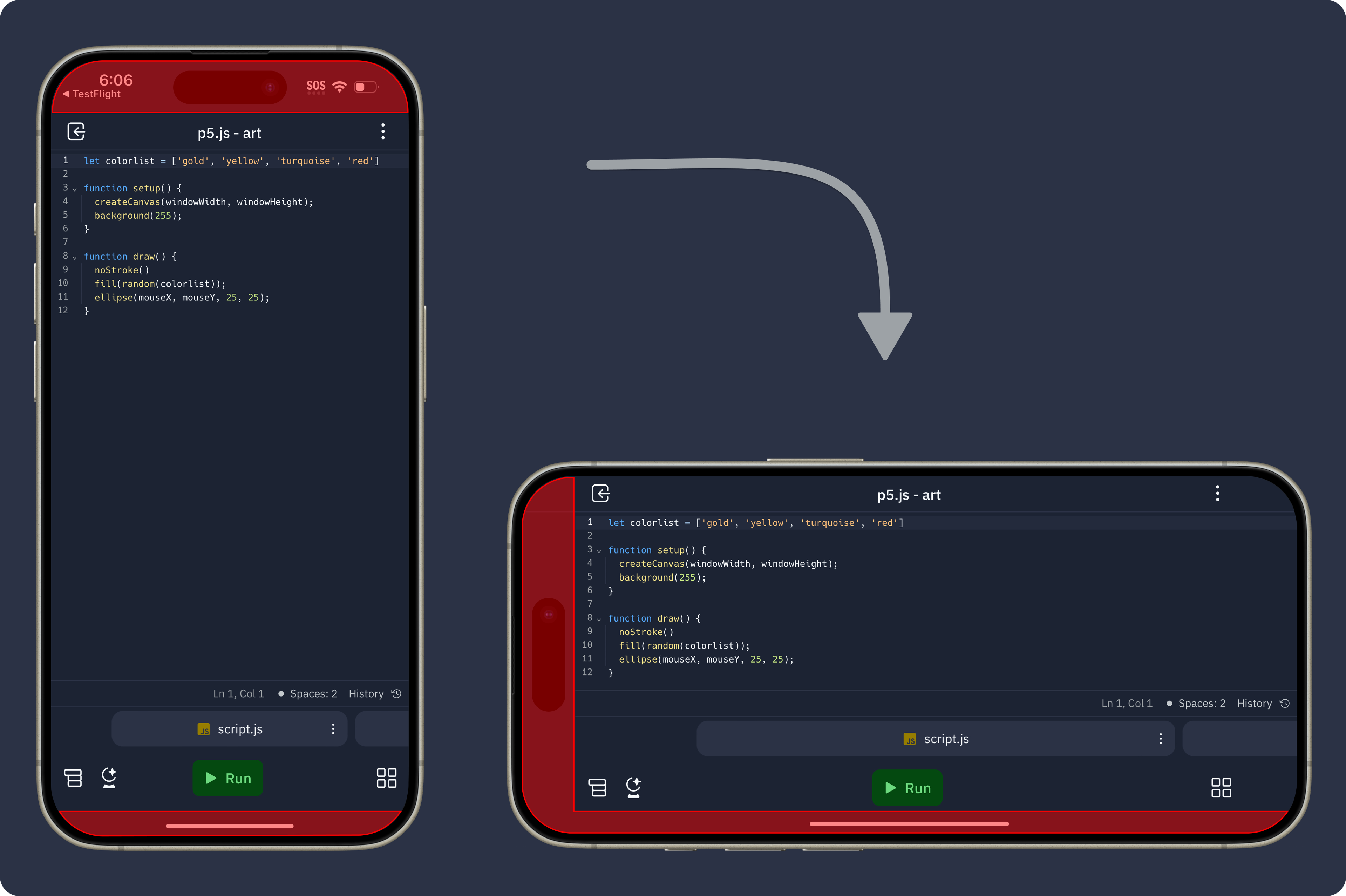
Rotating from landscape to portrait on iPad
What’s next for the Replit Mobile App?
There’s a lot we’d like to do! Some of the improvements we’re evaluating include making it easier to manage deployments, better hardware keyboard support, and UI changes to better utilize the extra screen space on tablets.
Interested in solving complex problems around developer tooling to empower the next billion software creators? Join our team!