I like the process of writing because of how simple and portable the tools are. Regardless of time or place, a way to write things down is never far away. There's very little friction between inspiration and experimentation. I wish writing code was more like this.
In fact, Repl.it is great for quickly experimenting with coding ideas. I can open a tab in my browser and start coding as fast as I can start writing an email. But what if I’m not near my computer? While Repl.it has always worked on phones, it was never optimized for it. That's why we're excited to release our first iteration of a mobile interface!
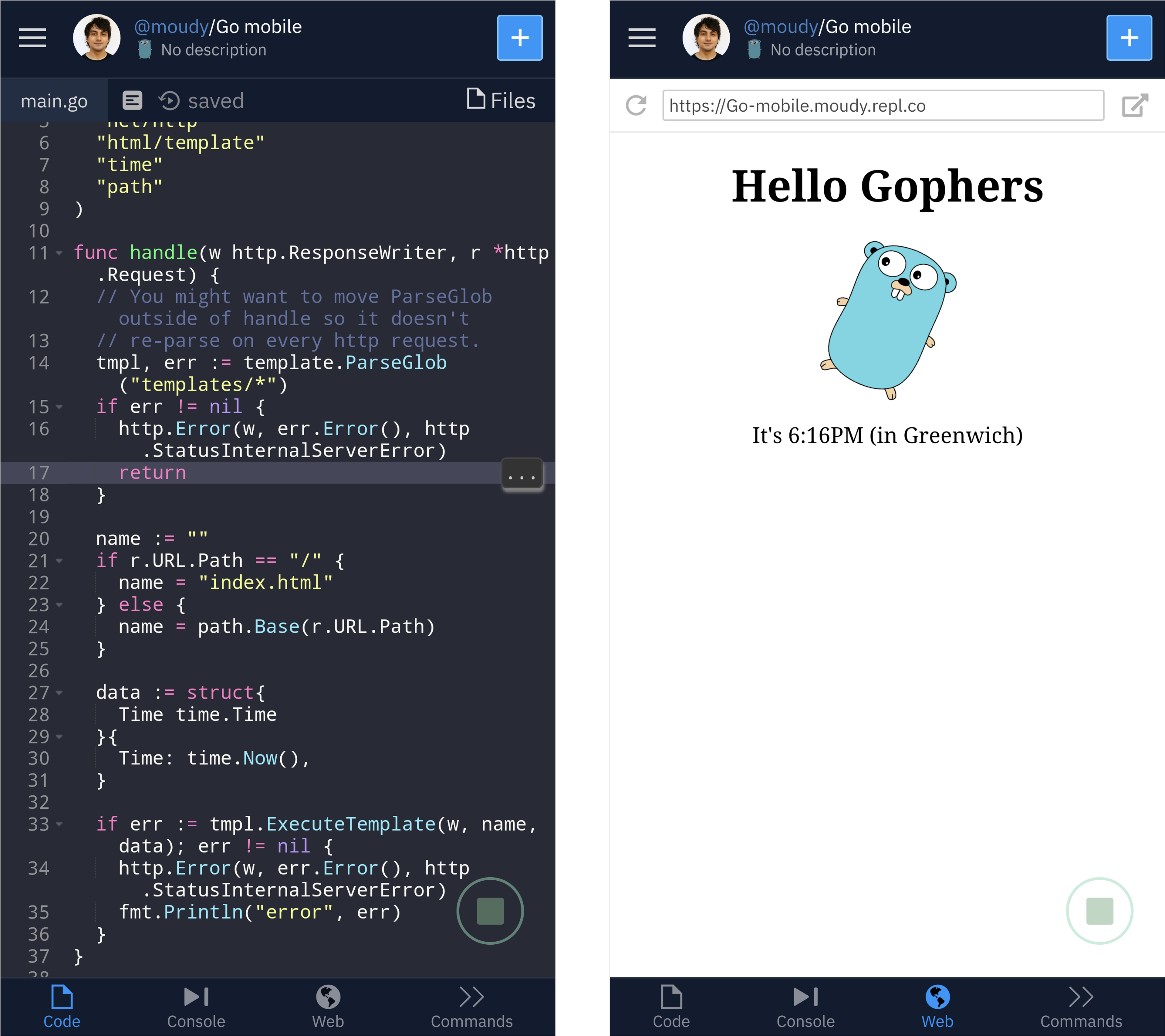
Here's a quick look at running a Go http server using one of our templates:
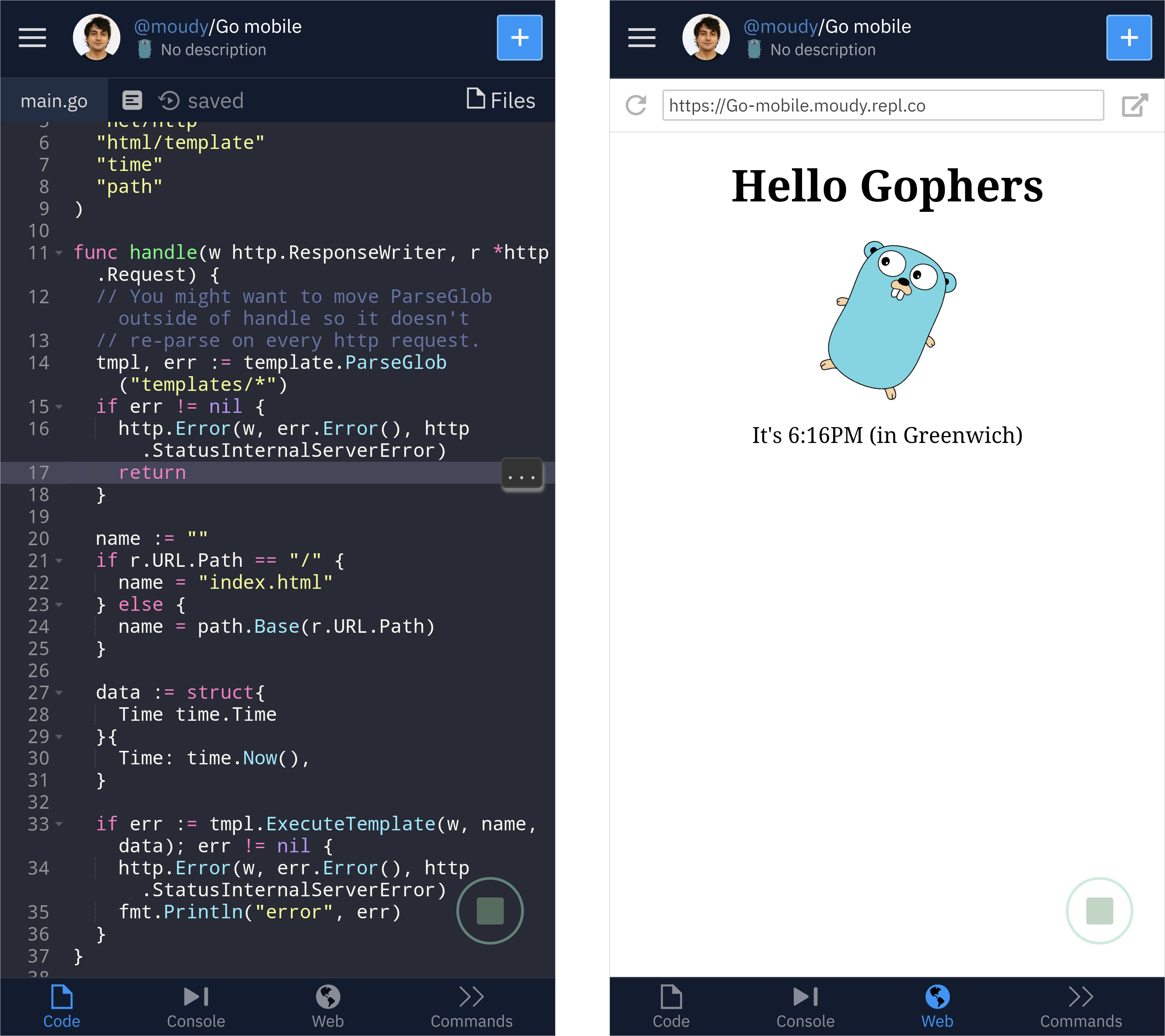
Rather than trying to adapt our desktop layout to a smaller screen we’re building this with native mobile design patterns in mind. We added a tab bar to the bottom of the screen. It acts as the primary navigation for the IDE similar to how native mobile apps do.
One of the challenges of mobile is the small screen size. Making the editor, console, and additions output tabs made sense. But what about other actions like managing multiplayer, version control, or settings? That's where the "commands" tab can help. The idea is that it's like a command-line interface for your repl where you can do various actions. This is still a work in progress but here's a preview of what that looks like:
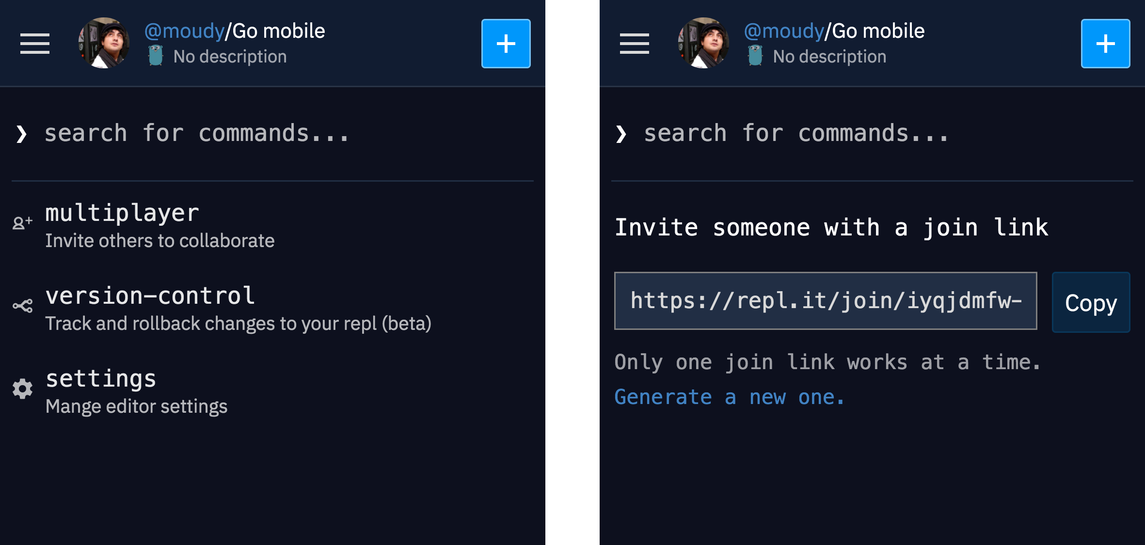
If you follow our blog, you might have read about our IDE's plugin framework, the mobile interface is using the same framework we built for our desktop UI. We reused all the same plugins but only had to lay them out differently using the layout engine. The framework's core is still under active development and we are making progress towards stabilizing it and eventually open sourcing it.
Check out the new interface below or open a repl on your phone (also you can add ?mobile=1 to a repl’s url).
