One of the challenges of adding new functionality to any interface is balancing discoverability with visual clutter. We've written before about how a universal command bar can be a great way to expose features without overloading the UI with buttons. This pattern already works well for us in our mobile interface, so now we're bringing it to desktop! Here's a demo of what it looks like:
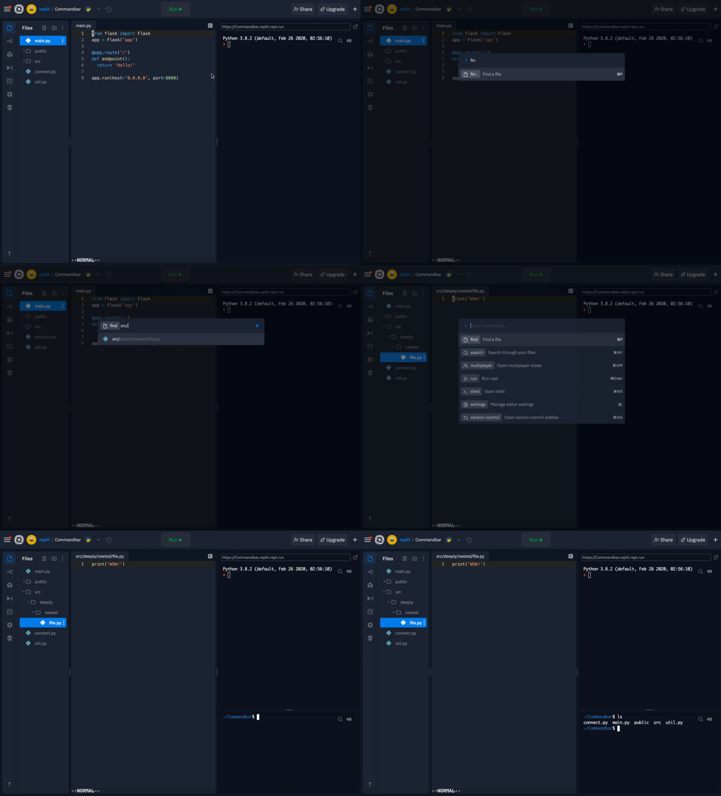
The new command bar replaces our old shortcuts and file switcher modal. Just like before, you can use keyboard shortcuts (Cmd/Ctrl + P to switch files, Cmd/Ctrl + K to bring up all the options, etc) to interact with it. As we add more commands, power users will be able to have a keyboard centric experience while beginners can learn about features by exploring the different options.
Among the new features introduced in the updated command bar is Search! Search indexes the contents of every file in your project (with the exception of hidden files such as node_modules and anything in your .gitignore) and allows you to see every instance of a query across every file in your repl. From there, you can scroll through the results, see which line and file they appear in, and select a result to navigate directly to that line in the code like so:
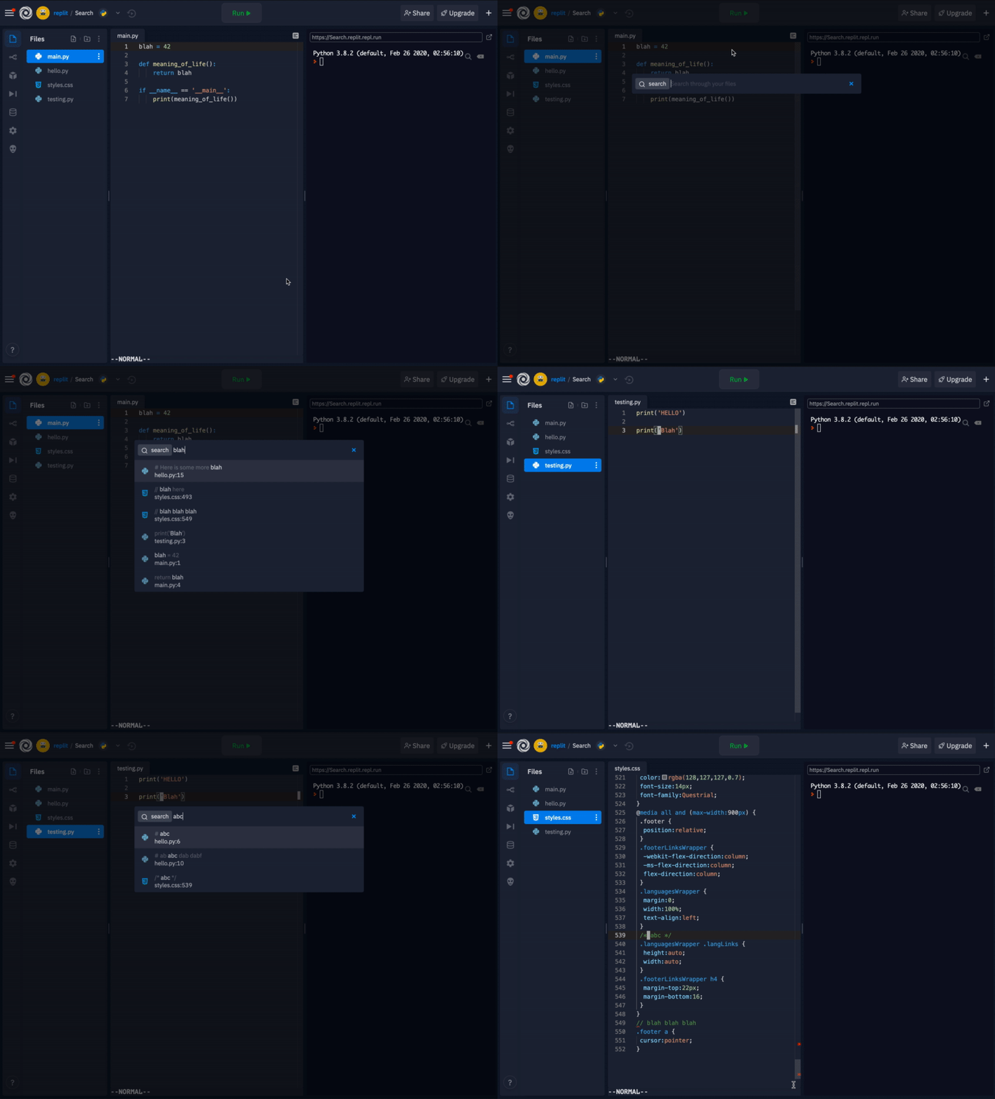
You can access Search via Cmd/Ctrl + Shift + F or by bringing up the command bar and typing “search”.
We're still thinking about the best way to surface these commands. Although keyboard shortcuts are the fastest way to use the command bar, they're notoriously underused and hard to discover. In the future, we'll likely add a dedicated button that opens the command bar directly. In addition, other primary actions can expose a way to open the command bar prefilled with a command (like Cmd/Ctrl + P opens the command bar directly in the "find" command).
Open up a repl and give it a try!
