Before we decided to build repl.it classroom, we paid a visit to one of the schools using us in the classroom. I felt excited and anxious at the same time; I was introduced to the teacher and students in the class, and then my job started as designer observing and paying attention to every single detail.[](preview end)
The teacher explained the workflow and had two students assisting her to check on the students. Seeing the teacher and student’s frustration made me see a problem, I noticed that most of the students were trying to communicate their frustrations, but they were either embarrassed or too shy. Others gave up too soon, without even trying. The two assistants solution might have been a good idea, but for students knowing the fact that they’re being watched or might be judged made them hesitant to ask for help. Towards the end of the class I was handed a piece of paper and was asked to list the student names who completed the assignment successfully.
A teacher should be able to see where her students are at—to have bird’s-eye view for the classroom so attention can be paid for the ones who need it the most, plus it would be good way to track progress. Hovering around each student individually can be time and energy consuming.
Introducing Classroom Overview
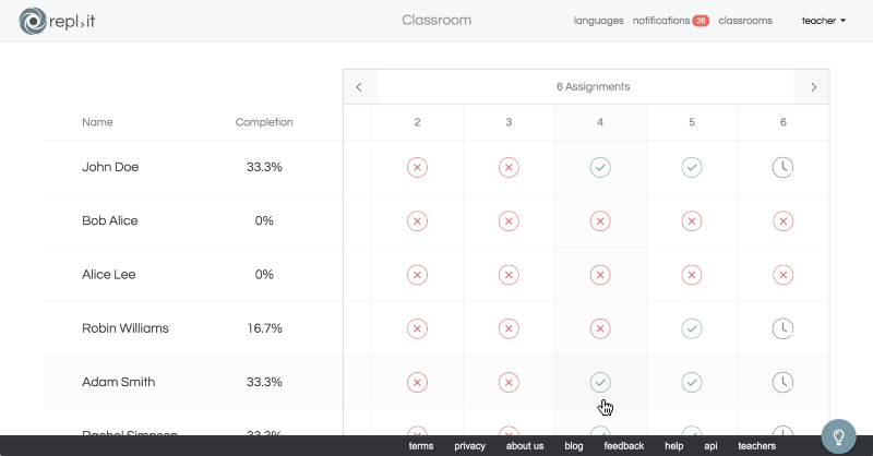
The Student Overview is a feature of the teacher dashboard that we’re introducing. Where previously you had to go into each assignment to see the progress for each student individually (which ironically mirrors the physical classroom experience described above). The teacher classroom dashboard is now divided into assignment and student sections. The assignments section lists out the assignments published or in draft and allows you to create a new assignment. The student section is all about the students, their names, completion percentages for all their assignments and the current submission status.
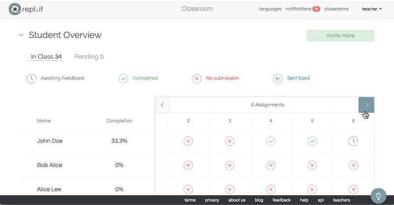
Browsing the student submission status for assignments is as easy as going left and right.
Teacher browsing assignments.
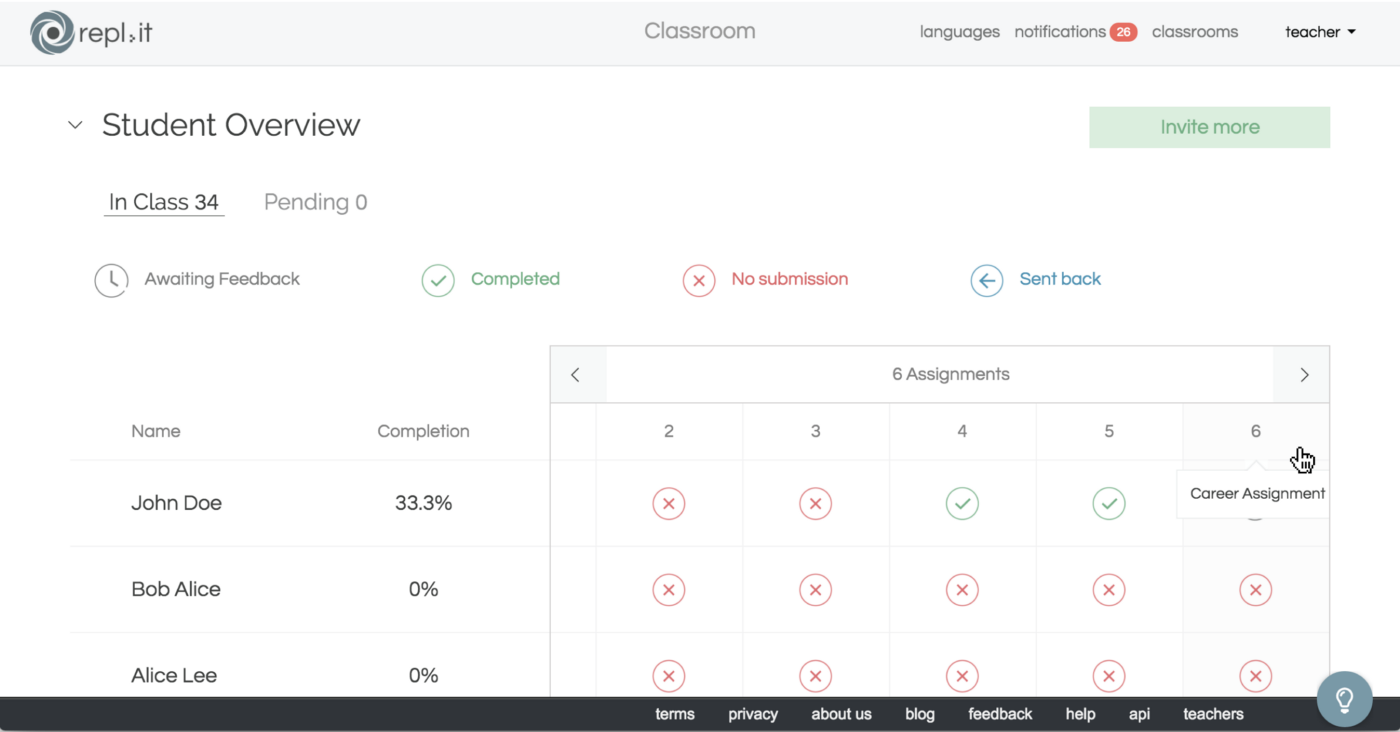
Assignments are listed as numbers but by hovering on the number the assignment name pops up as a reminder of that particular assignment. Teacher is hovering to check the name of the assignment

We did our best to make this as visually comprehensible as possible. Colorful icons, and a vertical and horizontal line highlighting to give you contextual awareness while browsing your student overview. Teacher hovering on a complete state
Teachers that we showed this too were really excited about it. We’re passionate about building the tools to make your jobs—as teachers—easier so let us know what you think about this. This product is currently in closed beta but you can sign up for it here.
