At Replit, we’re lucky to work with brilliant people who are building the programming tools of the future. This past year, we had the privilege of sharing some of this design work with the broader academic research community.
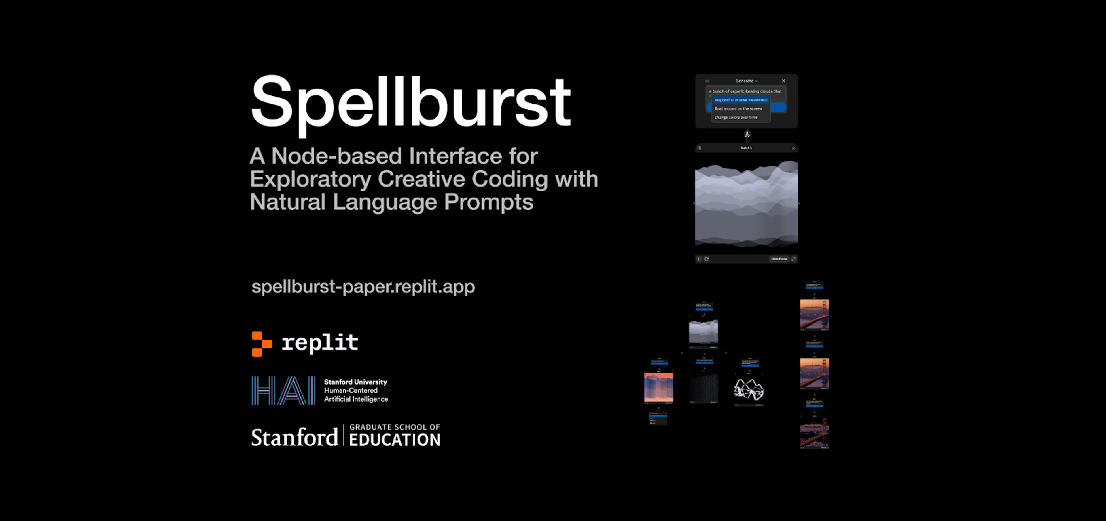
Tyler, design engineer at Replit, teamed up with Stanford University (Jenny Han – also former Replit intern), Miroslav Suzara, Christopher Pondoc, and Dr. Hari Subramonyam) to publish Replit’s first-ever peer-reviewed publication, Spellburst. In November, we presented our work at the ACM Symposium on User Interface Software and Technology (UIST), one of the premier venues for human-computer interaction research in the world.
This post will walk through what we built and researched, what we learned from the process, and some predictions for user interface design and AI in the future.
Introducing Spellburst
We went into this project knowing that we wanted to design for learning and creativity for coders. In our formative study, we interviewed 10 expert generative artists to understand their existing workflows. What we discovered about the exploratory process for creative work is that creative coders are constantly:
- Going from idea to code
- Creating and tracking variations
- Comparing/combining outputs.
However, current programming tools don’t support these types of rapid creative exploration. With this research problem in mind, we set out to design Spellburst.
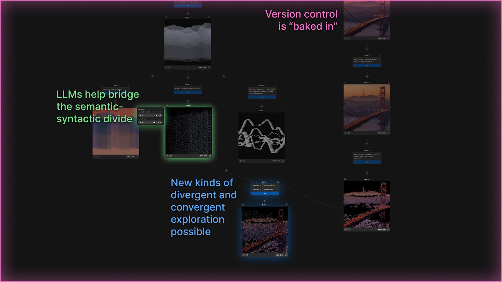
Spellburst is a large language model (LLM) powered creative coding environment designed for exploration and iteration that features:
1. A canvas where users can create, modify, and merge p5.js sketches
Spellburst canvas
2. Natural language prompts to guide the art generation, like make the lights brighter
Spellburst modify
Spellburst merge
3. Seamless switching between coding directly, prompting, and hybrid controls for tweaking how exactly the prompts affect the code they generate.
Spellburst sliders
Here’s a 4-minute walkthrough of Spellburst:
With our research prototype, we conducted an evaluative study with various experts. You can read the full paper here (which briefly went viral on Hacker News).
What we learned from the research process
How did we get here? This project was 1.5 years in the making, and we learned a lot along the way.
1. Research is non-linear
Research works at a very different timescale than industry. Being able to meet weekly for 1.5 years and iterate on our work was a luxury compared to Replit’s usual cadence when it comes to shipping features. This timescale also allowed us to pivot multiple times throughout the project, from our interest in online learning to version control to creativity support tools.
2. Research is designing for the future
In many ways, participating in a research conference is like designing for a high-end fashion show. Most of these ideas presented may not be practical or even realistic for real-world consumers today, but the research projects are meant to provoke, forecast trends, push the industry forward, and lay the foundation for real technology people can use. Replit is happy to be a part of that future.
This project marks Replit’s first foray into academic research, which is somewhat rare for a startup our size. Replit was the outlier next to Meta, Adobe, Google, and other industry partners at UIST with strong ties to academia. However, our collaboration left us energized to think through new models and possibilities for industry-research partnerships. Given the acceleration of AI, it’s more important than ever to be thinking deeply about the future of human-computer and human-AI interaction.
What we learned about the future of user interfaces at UIST
We had a blast presenting our work live at the UIST conference in November. You can watch our full talk at UIST here.
From October 29th to November 1st, hundreds of researchers from around the world convened at the Fairmont Hotel in San Francisco to present cutting-edge research on AR/VR, hardware, interfaces for AI, tools for creativity, and more.
Here are some facts about the participants who came to UIST:
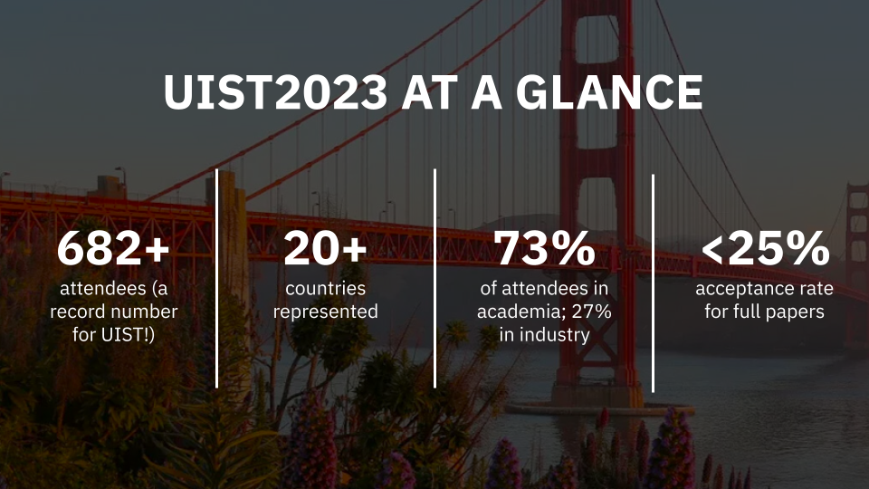
Here’s a small sample of the kinds of projects that people presented:
- What if we could simulate a society with generative AI? (Link)
- What would “incognito mode” look like in the metaverse? (Link)
- What if we designed a fork that allows users to experience garlic without causing bad breath? (Link)
- What if we could harvest energy from inflatables? (Link)
- What if we could simplify app development with a new state management system inspired by spreadsheets? (Link)
We attended some amazing talks from other researchers and industry leaders, from David Holz of Midjourney to Geoffrey Litt at Ink & Switch to Meredith Morris at Google AI.
While we weren’t able to attend all of them, we highlighted a few below that stood out to us (check this playlist to see most of the live talks):
- David Holz, founder of Midjourney and co-founder of Leap Motion delivered the introductory keynote where he shared learnings and some goals for the future. This keynote was not recorded, but we liked the way that he talked about his goals for “the aesthetic singularity,” creating “interfaces for wandering,”, and imagining Midjourney as more of a “very slow game engine / world model” than an image generator.
- Dr. Ivan Poupyrev, award-winning technology leader, scientist, and designer, gave the UIST 2023 Vision Talk provocatively titled “The Ultimate Interface”(UIST 2023 Vision Talk - The Ultimate Interface) where he invoked a future vision for interactive systems design and development. He left some open questions:
- Dr. Meredith Morris, Director and Principal Scientist for Human-AI Interaction Research at Google DeepMind, gave the second UIST 2023 Vision Talk also provocatively titled, “AGI is coming! Is HCI ready?” In this unrecorded talk, she defined what she meant by “AGI” and why she believes we are within five years of reaching this milestone.
- Dr. Judith Fan, cognitive science professor at Stanford University, gave the UIST 2023 Closing Keynote. She reminded us that a glimpse of the future requires a careful study of the past, and posits that natural language and drawings were the original cognitive interfaces for technology. UIST 2023 – Closing Keynote
Here are all of our takeaways about the future of user interfaces based on the research we saw at UIST:
1. Go beyond “GPT wrappers.”
A lot of projects were built on top of ChatGPT at UIST this year, but none of them were chatbots. Instead, we saw researchers build novel interfaces and/or novel AI architecture that leveraged Large Language Models (LLMs).
For example, consider the paper, “Generative Agents: Interactive Simulacra of Human Behavior,” which won a Best Paper Award for its novel use of LLMs in simulating human behavior. In this research project, the authors designed a sandbox society modeled after The Sims with 25 LLM-powered characters, called generative agents. The authors designed an architecture that stored each agent’s memories, used a large language model to synthesize those memories into higher-level reflections, and programmed each agent to be able to retrieve their memories to plan future behaviors. The authors then observed the 25 agents engage in realistic day-to-day behaviors across town, including in social interactions with each other.
To learn more: Generative Agents: Interactive Simulacra of Human Behavior
2. Text is not the universal interface.
Continuing the push away from chatbots, we saw project after project ditch natural language as their primary interface. This wasn’t surprising. Many researchers in the field not present at UIST have already called out the idea that “natural language is the lazy user interface” (Austin Henley) and given us reasons “why chatbots are not the future” (Amelia Wattenberger).
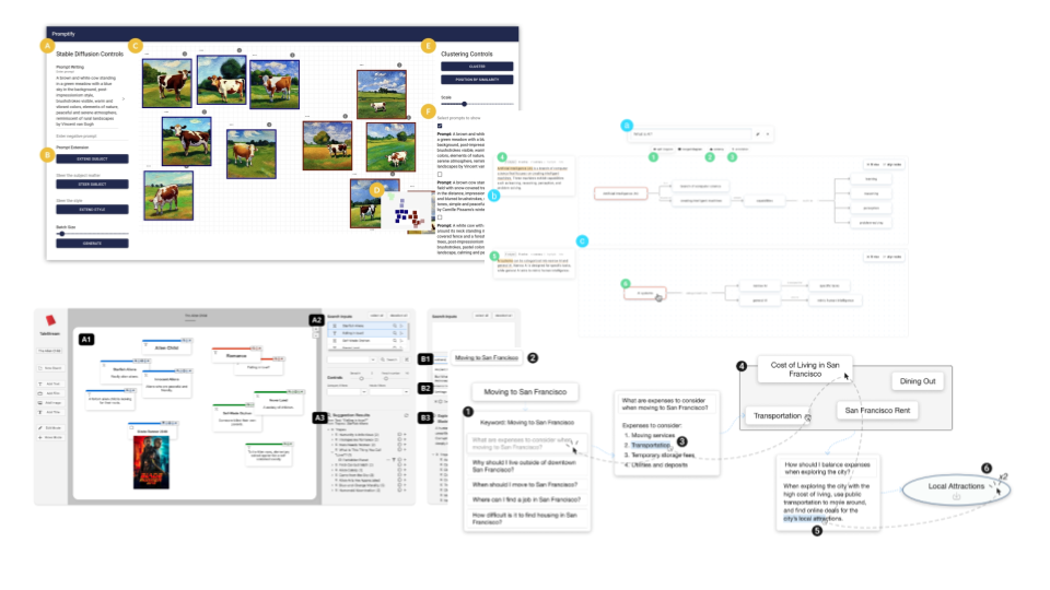
Interestingly, at UIST, we noticed that many projects (including our own) had all independently converged upon a node-based UI on an infinite canvas:
- Graphologue which produces node-based diagrams in response to an end user’s questions; the diagrams show connections between concepts
- Promptify is a node-based interface that helps users iterate on their text to image generations
- Sensecape is a node-based interface that allows you to zoom in and out of different levels of abstraction for information
- TaleStream which is a node-based interface for screen-writing inspiration
- Spellburst – our project, which provides a node-based interface for creative coding!
All of these projects honed in on the same affordances of an interactive canvas: the ability to zoom in and out through layers of abstraction, view the progression of your work in a non-linear way, and manipulate objects with sliders and other UI. It turns out that maybe diagrams are worth 1,000 words after all.
In fact, one of the papers at UIST, “Cells, Generators, and Lenses” provided an overarching design framework for object-oriented interactions with LLMs that captures the design frameworks employed by many of the above projects.
3. “The biggest user interface problem is control.”
We heard this quote from David Holz in the opening keynote and saw this as a recurring theme throughout many presentations that we attended. In many ways, it summarizes the central challenge of a designer. How much control do users need and want? How can we give more control to users up and down the ladder of abstraction?
Many systems at UIST sought to give users the ability to fluidly transition through a “semantic zoom” between high-level overviews (i.e., what is the “shape” or journey of my project so far on the canvas?) to granular details (i.e., how should I modify this particular variation and how does it influence the current iteration and compare to prior iterations?). LLMs made this kind of semantic zoom possible.
Control was also manifested through bidirectional editing, or allowing the user to edit/view information from the system in two ways, at two different levels of abstraction. An example is the use of semantic sliders in Spellburst and the split code/output views, where a user can edit code directly or simply move a slider corresponding to semantic designs and see the output and code immediately change. We saw many connections between this work and Bret Victor’s talk, “Inventing on Principle,” in which he says that “creators need an immediate connection to what they’re creating.”
Control at its core is also about power – who gets to design tools, and what does it actually mean to empower an end user through an interface or tool? (Link)
In the end, we were left with an interesting quote: “It’s easy to replace humans. It’s hard to make humans better” from David Holz. Merry Morris said something similar. In the end, the job of the interface designer is to either “help people do challenging things” or “make challenging things trivial.” Good interface designers try to do both.
What’s next?
We’re excited to release Spellburst as a public demo in Winter 2024, suitable for personal and educational use. While Spellburst itself won’t necessarily appear on Replit as of now, and we know our research will impact how we think about programming interfaces at Replit and beyond.
We’re hiring people who are interested in designing, building, and researching the future at Replit.
You can check out our work here.
