“Command line interfaces. Once that was all we had. Then they disappeared, replaced by what we thought was a great advance: GUIs. GUIs were - and still are - valuable, but they fail to scale to the demands of today's systems. So now command line interfaces are back again, hiding under the name of search. Now you see them, now you don't. Now you see them again. And they will get better and better with time: mark my words, that is my prediction for the future of interfaces.” [1]
Don Norman wrote this in 2008. Since then, search has become more powerful and users have grown more dependent on it-- searching for information with context-aware autocomplete is present in almost every popular digital product. Traditional CLIs, however, were never widely adopted by end-users because of their learning curve. Terminals, the primary platform for command-lines, are intimidating and feel like a black box to non-technical people. Also, a text-only interface is limiting-- it only allows actions to take place through language instead of the clicks, taps, and hovers that we’re used to today. Commands and flags often have obscure names, and spelling mistakes can result in cryptic errors, or worse, doing something you didn't intend.
Despite all these problems, CLIs are still powerful. The input mechanism is always the same: text. It’s predictable and constant. Adding more commands takes minimal effort from the developer. Users aren’t overwhelmed with information-- you just specify the exact commands you need at any given moment. These benefits, however, come with the tradeoff that commands must be memorized to be efficient.
Today, GUIs are the most popular user interface paradigm because they address many of the concerns above. They use visual metaphors for everyday objects we are used to: desktops, windows, tabs, buttons, menus, files, and folders. They’re intuitive and offer a small learning curve to perform basic actions, like moving files via drag and drop. It’s faster to recognize an icon than to remember the action’s name. The benefits of GUIs are rooted in both memory recognition, which “...refers to our ability to “recognize” an event or piece of information as being familiar”, and memory recall, which “...designates the retrieval of related details from memory.” [4, 5]
So GUIs are obviously the best UI paradigm ever, right?
Probably not. Although GUIs might solve some core usability issues that most CLIs present, they "...fail to scale to the demands of today's systems" [2, 3]. The moment you want to add a feature to a GUI, there’s an immediate question about where to put that feature. Should it be in the top right? Bottom left? Nav bar? Behind a tab? In the sidebar? Revealed on hover?
You end up with buttons, panels, and menus competing for space in the UI-- screen real estate. Every pixel becomes more and more valuable for primary features. You don’t need to look very far to see what happens when you need to include dozens of features into a tiny rectangle.
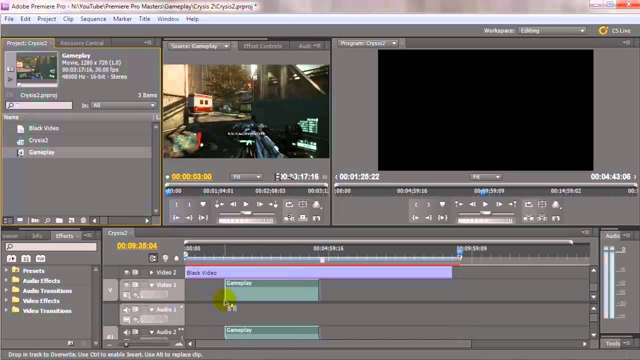
Adobe Premiere UI. Source
Can you see the issue here?
There’s a reason using simple, lightweight software feels like a breath of fresh air. Professional creative tools like Adobe Premiere are often so packed with features that they become unapproachable, slow, ugly, and unfocused. YouTube is swamped with multi-part tutorials that deter beginners from learning. Power users will show you that their workflows are heavily dependent on keyboard shortcuts, elaborate workspace setups, custom automation tools and plugins, and help/search bars.
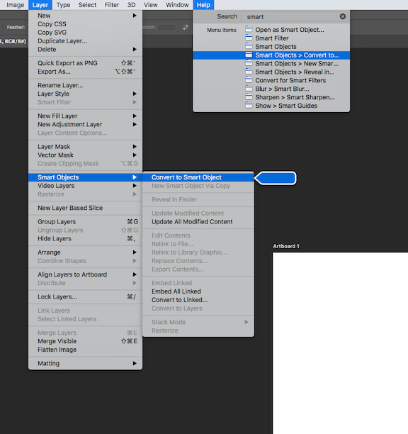
Are nested dropdowns the 10th circle of hell?
This isn’t a problem with GUIs inherently but rather a symptom of poor product scaling, which can often affect the density of a GUI first. The biggest issue with GUI density is throwing new features into endless submenus, dropdowns, hidden settings pages, or worse, the dreaded “more” button (which currently plagues Repl.it as well). Some apps try to mitigate this UI flood by using progressive disclosure: gradually revealing information to the user over time to avoid cognitive overload and make usage context clearer [6]. But the double-edged sword here is that reducing clutter in a UI can potentially make features harder to discover. A “simple UI” doesn’t necessarily mean it’s simple to use. Simplicity instead should be an emergent property of a well progressively disclosed UI.
The interesting thing about bloated GUIs is that they beg for search. Once menus become deeply nested and panels flood your screen, it feels natural to want to search for something. You don’t want to look for what you need; you just want it in front of you immediately. However, the UX of searching to easily navigate through deeply nested menus seems like an afterthought. What if it was the primary way to interact with a tool?
Many popular products and services are starting to explore this thought. In a way, voice assistants are one of the closest things we have to a synthesis of GUIs and CLIs. The input is semi-structured natural language (CLI-inspired) but the output can be rich media and interactive controls (GUI-inspired).
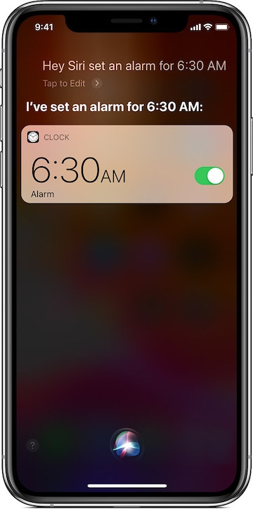
When you ask Siri to turn on alarms, iOS will bring up portions of familiar GUI elements to further interact with. Source
There are also plugins like Runner Pro for Sketch (a UI design tool) that allows you to quickly access information and automate design actions [7].
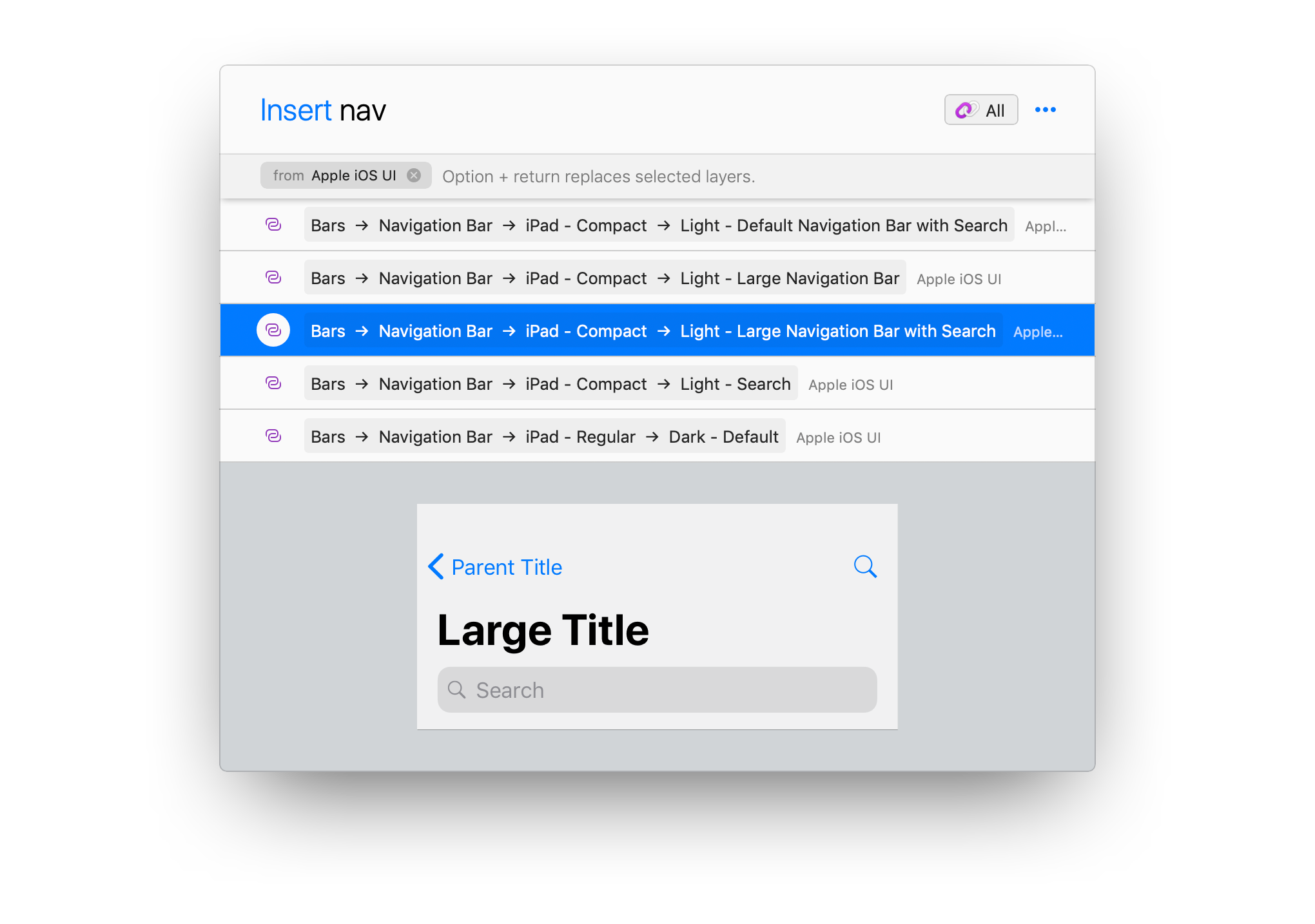
Kind of funny that CLI-inspired interfaces are also useful in design tools. Source
At Repl.it, where our goal is to build a simple yet powerful programming environment, we run into UI scalability issues every time we have an IDE feature to add. So when it came to building our admin tools, we decided to explore a new UI paradigm. We often need to do simple things like changing single values in the database, so it’s usually easier to connect to the database directly and run some SQL than build new UI for it. But that's both unsafe and excludes anyone unfamiliar with SQL or the CLI. So we asked ourselves, “how can we marry the conciseness of CLIs with approachability of GUIs in the same interface?”
There are a few requirements for a CLI to be approachable:
- You should be able to use it with a mouse. This may seem contradictory to CLIs as a paradigm since their real power comes from using the keyboard, but being able to click through commands does two things: gives beginners a chance to "level up" to the keyboard and makes the interface more approachable. It also paves the way to make programming environments more accessible via touch and mobile.
- It needs to be discoverable. That means context-aware autocomplete with clear and concise language providing the right level of detail about a command. The primary issue with discoverability in CLIs is that the commands are invisible. You either need to have memorized the commands already or use some form of documentation to gain access. In CLUI, the commands come to you.
- The output should support rich and interactive media. That means that images, gifs, video, graphs, interactive diagrams, buttons, and forms should be able to integrate directly into the CLI experience. ASCII art is fun, but text is only as useful as the information it can convey. Interactive media should be treated as a first class citizen.
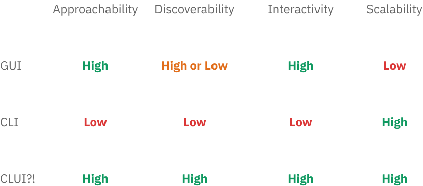
To meet these requirements, we started to build CLUI: an easily extensible interface that blends GUIs and CLIs. On the surface, it’s simple: type in what you want, and get suggestions for commands. When you enter a full command, you get back some UI relevant to what you asked for. But the potential here is much larger than just a CLI with autocomplete and buttons. Eventually, we plan on making all of Repl.it accessible through CLUI.
While there are dozens of features we could have implemented first, we prioritized the three bullets listed above. Keep in mind these are prototypes!
1. Approachability

Being able to click through the commands makes CLUI more approachable to beginners than traditional CLIs.
2. Discoverability

Autocomplete and fuzzy-search makes commands significantly more discoverable.
3. Interactivity
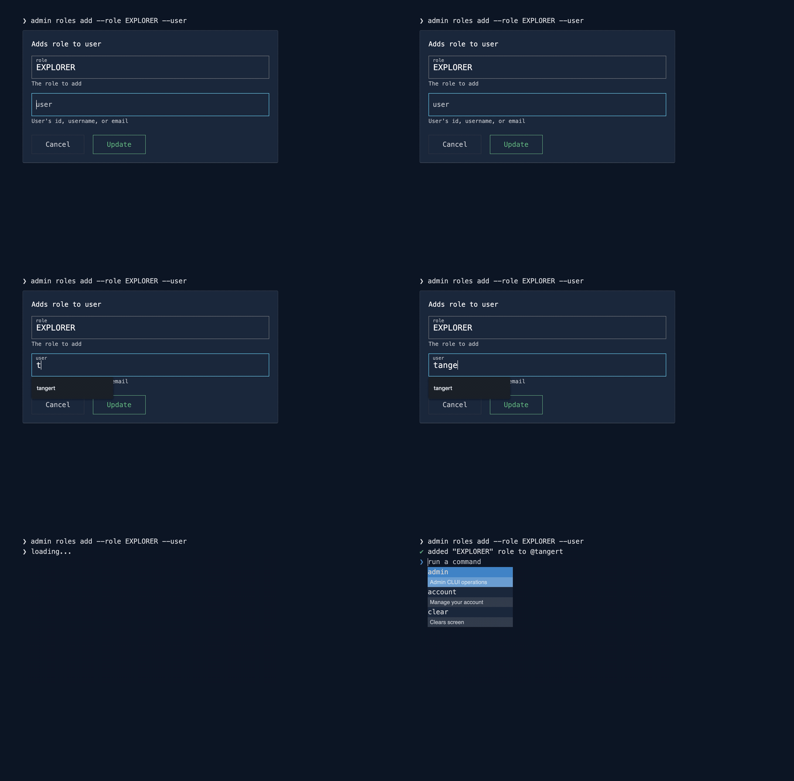
Interactive form elements makes interacting with the output of CLUI commands much more approachable.
One of the unique parts about CLUI is that any new UI is automatically generated from the data you give it. This means that adding features is as simple as adding commands on the backend. It’s an incredibly scalable approach for a small team like ours, and it makes new features much more modular and easier to reason about.
On a high level, CLUI really operates like a flowchart or a decision tree. You start at the root of the tree and gradually select commands one by one. Once you are done going down the tree (similar to a depth first search), you end up with your complete command.
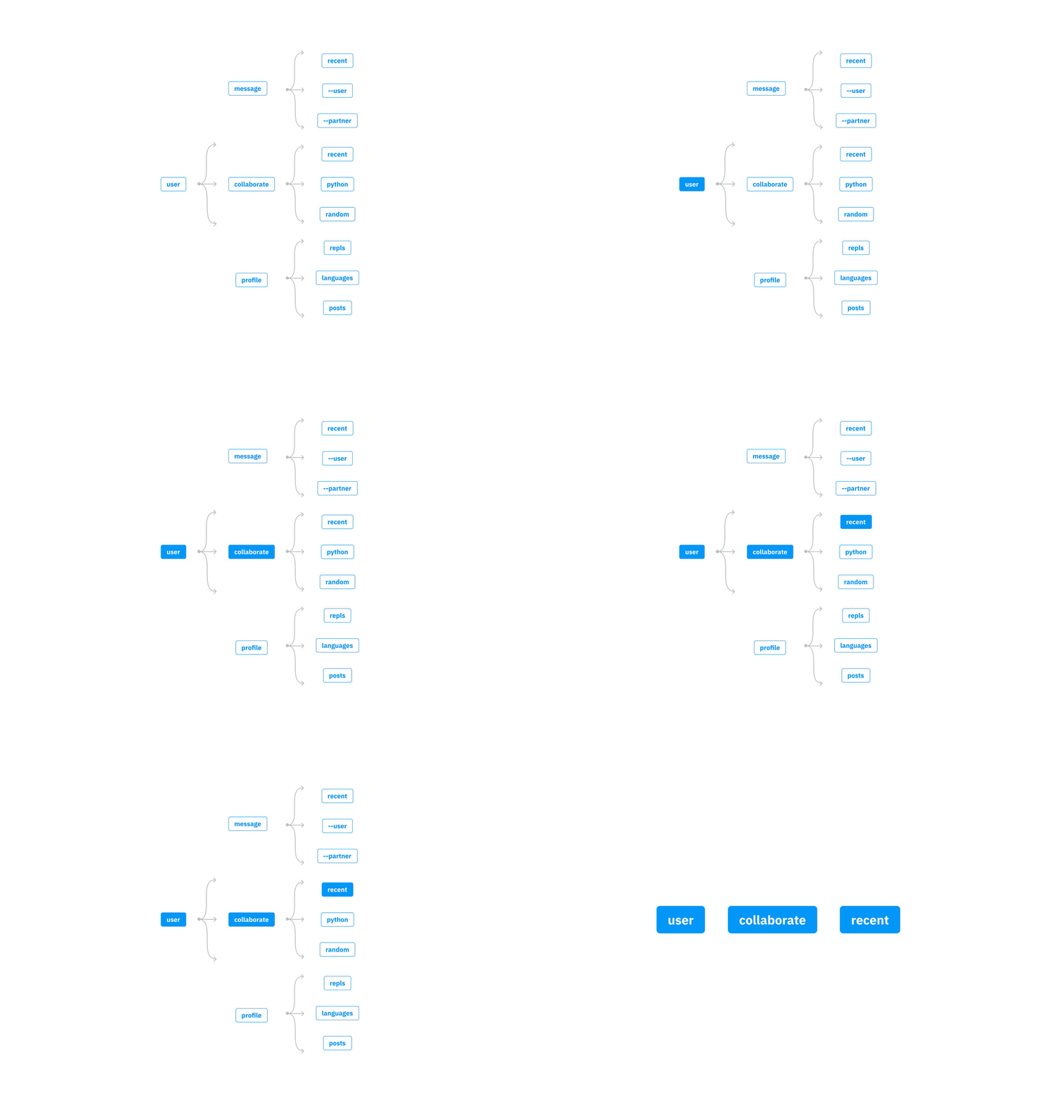
Going down the command tree. Disclaimer: these are currently not real commands.
Because the tree is hierarchical, you might think that it actually resembles a large dropdown menu. The difference is that search is built directly into its navigation, not just pointing and clicking. One clear improvement that could be made is being able to search for any subcommand without having to specify its parent command first. That way you can access any deeply nested information instantly, similar to spotlight search.
On a technical level, a CLUI command is conceptually similar to a file path or URL. Since a complete CLUI command is simply a path down the command tree, each potential subcommand is like a portion of a file path or URL. Flags, on the other hand, function like query parameters. CLUI’s resemblance to URL paths means you can send someone a complete, executable CLUI command as a URL. They’re mapped 1:1.
Since we have a GraphQL backend, we know all the potential fields and arguments a client can use. By using an introspection query we generate a tree of commands/sub-commands that map onto their respective resolve functions. Now, to add a new admin command all that's needed is a new field on a GraphQL type.
CLUI’s architecture thus makes it easy to create a direct mapping between our data primitives and UI primitives. For example, booleans are mapped to toggles or checkboxes and JSON is mapped to an auto-generated form. That means that we can focus on features of our product in isolation and trust that CLUI will help us manage their complexity.
Some of our future plans for CLUI include, but aren’t limited to:
Unified terminal, REPL, shell, and spotlight search. We want to eventually combine all command driven user interfaces together— this includes navigating the website, finding relevant information, action automation, and of course, traditional access to the UNIX shell and any language REPL. Many people are confused by the difference between the REPL and shell, and advanced users are often frustrated when they have to switch contexts and leave one or the other. Making a unified, CLUI driven design pattern across Repl.it will help mitigate both sides of these issues.
End user programming. Empowering our users to customize Repl.it and make CLUI work for them is one of our primary goals. You can easily imagine users being able to create aliases/shortcuts for base CLUI commands. For example, repl new python —invite rachel95 could be mapped to lesson with rachel. The power in this comes from combining these shortcuts together, essentially abstracting away from our standard library of CLUI commands altogether and allowing users to create their own pseudo-languages to command Repl.it. When you extend this concept of user-created shortcuts to include parameterization, suddenly any command acts like a function— and the idea of piping inputs and outputs between commands becomes obvious. Users will be able to share, remix, and plug and play an entire command store’s worth of automation tools and utilities that make Repl.it truly unique to each user.
We've open-sourced some of the code used to build this system. There's also a demo application that shows how everything works together. Right now, CLUI is offered as an unopinionated library for dealing with trees of commands- so you can bring your own UI and use it anywhere JavaScript runs. For example, we’re going to use CLUI as a base for a Figma plugin to automate parts of our design workflow, similar to Sketch Runner. We’re excited to see what the community (you!) can do with CLUI and your input on its design.
Ultimately, all user interfaces-- command driven or graphical-- are supposed to convey important, actionable information while being imperfect models of how people expect them to behave. There's a constant struggle to figure out how much information to expose, how to expose it, when, where, and why. Although we know that CLUI won’t be a panacea for Repl.it’s UI and UX development going forward, we think it'll help us through many core design scalability problems and hopefully get rid of some dropdown menus along the way.
Sources:
- https://jnd.org/ui_breakthrough-command_line_interfaces
- https://www.computerhope.com/issues/ch000619.htm
- https://jnd.org/natural_user_interfaces_are_not_natural/
- https://www.nngroup.com/articles/recognition-and-recall/
- https://www.nngroup.com/articles/ten-usability-heuristics/
- https://en.wikipedia.org/wiki/Progressive_disclosure
- https://sketchrunner.com/
Update
Since we've posted this article last year, we've made some progress integrating the CLUI paradigm into our app:
And inside the IDE. Notice I can search, find files, manage multiplayer, and even start a new repl pic.twitter.com/zTAmT5zZPk
— Amjad Masad ⠕ (@amasad) May 5, 2021


